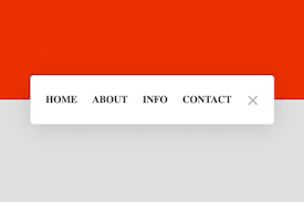
Ẩn hiện menu với CSS3 và jQuery
Chia sẻ
Một menu với khả năng linh động sẽ giúp ích rất nhiều cho những trang web không có quá nhiều diện tích trong việc hiển thị nội dung. Với sự kết hợp giữa CSS3 và jQuery, chúng ta sẽ hoàn toàn có thể tạo được những menu với khả năng ẩn hiện hết sức linh hoạt. Mẫu menu mà mình giới thiệu cho các bạn trong bài viết này là minh chứng rõ ràng cho những điều mình vừa nói.
1. HTML
<div class="menu expanded">
  <div class="container close">
    <div class="toggle close"></div>
  </div>
  <span class=""><a href="#">Home </a></span>
  <span class=""><a href="#">About</a></span>
  <span class=""><a href="#">Info</a></span>
  <span class=""><a href="#">Contact</a></span>
</div>
2. CSS
html {
  font-size: 16.36364px;
}
html ul li {
  list-style: none;
}
html body {
  display: flex;
  justify-content: center;
  align-items: center;
  position: relative;
  min-height: 95vh;
  background: #E0E0E0;
  border: 2.5vh solid #ffffff;
  /*animation: respiration ease-out 3s 1s;
    animation-iteration-count: infinite;*/
}
html body:before {
  position: absolute;
  top: 0;
  left: 0;
  right: 0;
  bottom: 50%;
  background: #D84315;
  content: "";
}
html body .menu {
  position: relative;
  display: flex;
  flex-direction: row;
  justify-content: space-between;
  align-items: center;
  box-sizing: border-box;
  height: 70px;
  width: 70px;
  padding: 15px 20px;
  border-radius: 5px;
  background: #ffffff;
  box-shadow: 0 4px 64px rgba(0, 0, 0, 0.15);
  transition: 1.3s cubic-bezier(0.53, 0, 0.15, 1.3);
  z-index: 2;
}
html body .menu.expanded {
  height: 80px;
  width: 400px;
}
html body .menu span {
  white-space: nowrap;
  visibility: visible;
  opacity: 1;
  transition: .3s;
  transform: rotateY(0deg);
}
html body .menu span:nth-of-type(1) {
  transition-delay: .4s;
}
html body .menu span:nth-of-type(2) {
  transition-delay: .5s;
}
html body .menu span:nth-of-type(3) {
  transition-delay: .6s;
}
html body .menu span:nth-of-type(4) {
  transition-delay: .7s;
}
html body .menu span.hidden {
  width: 0;
  visibility: hidden;
  opacity: 0;
  transform: rotateY(90deg);
}
html body .menu span.hidden:nth-of-type(1) {
  transition-delay: .3s;
}
html body .menu span.hidden:nth-of-type(2) {
  transition-delay: .2s;
}
html body .menu span.hidden:nth-of-type(3) {
  transition-delay: .1s;
}
html body .menu span.hidden:nth-of-type(4) {
  transition-delay: 0s;
}
html body .menu a {
  text-decoration: none;
  text-transform: uppercase;
  font-weight: bold;
  color: #333333;
  padding: 5px;
  transition: .3s;
}
html body .menu a:hover {
  color: #D84315;
}
html body .container {
  order: 1;
  width: 20px;
  height: 24px;
  padding: 5px;
  display: flex;
  flex-direction: row;
  justify-content: space-between;
  align-items: center;
  cursor: pointer;
}
html body .container:hover .toggle:before {
  top: -9px;
}
html body .container:hover .toggle:after {
  bottom: -7px;
}
html body .container .toggle {
  position: relative;
  width: 100%;
  height: 2px;
  background: #aaaaaa;
}
html body .container .toggle:before {
  position: relative;
  display: flex;
  top: -7px;
  height: 2px;
  width: 100%;
  background: #aaaaaa;
  content: "";
  transition: top .25s ease, bottom .25s ease, transform .5s ease;
}
html body .container .toggle:after {
  position: relative;
  display: flex;
  bottom: -5px;
  height: 2px;
  width: 100%;
  background: #aaaaaa;
  content: "";
  transition: top .25s ease, bottom .25s ease, transform .25s ease;
}
html body .container .toggle.close {
  height: 0;
}
html body .container .toggle.close:before {
  transform: rotate(45deg);
  top: 0;
}
html body .container .toggle.close:after {
  transform: rotate(-45deg);
  bottom: 2px;
}
@keyframes respiration {
  0% {
    min-height: 100vh;
    border: 0vh solid #ffffff;
  }
  75% {
    min-height: 95vh;
    border: 2.5vh solid #ffffff;
  }
  100% {
    min-height: 100vh;
    border: 0vh solid #ffffff;
  }
}
3. JAVASCRIPT
Mong bài viết giúp ích được các bạn phần nào trong thiết kế Web. Hãy nhấn nút Chia sẻđể mọi người cùng học hỏi kiến thức mới nhé. Cảm ơn các bạn đã quan tâm Forum.