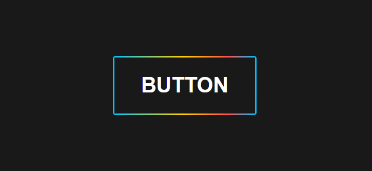
Animated Rainbow Button với HTML và CSS
Chia sẻ
Mẫu Button với hiệu ứng rê chuột đổi màu viền tông đen chất như CodePen với HTML và CSS
1. HTML
<a href="#" class="rainbow-button" alt="Button"></a>2. CSS
body {
			margin: 0;
			background-color: #191919;
			min-height: 100vh;
			display: flex;
			align-items: center;
			justify-content: center;
			font-family: Helvetica, Sans-serif;
		}
		a {
			text-decoration: none;
			color: #fff;
		}
		.rainbow-button {
			width: calc(20vw + 6px);
			height: calc(8vw + 6px);
			background-image: linear-gradient(
				90deg,
				#00c0ff 0%,
				#ffcf00 49%,
				#fc4f4f 80%,
				#00c0ff 100%
				);
			border-radius: 5px;
			display: flex;
			align-items: center;
			justify-content: center;
			text-transform: uppercase;
			font-size: 3vw;
			font-weight: bold;
		}
		.rainbow-button:after {
			content: attr(alt);
			width: 20vw;
			height: 8vw;
			background-color: #191919;
			display: flex;
			align-items: center;
			justify-content: center;
		}
		.rainbow-button:hover {
			animation: slidebg 0.8s linear infinite;
		}

		@keyframes slidebg {
			to {
				background-position: 20vw;
			}
		}
3. JAVASCRIPT
Mong bài viết giúp ích được các bạn phần nào trong thiết kế Web. Hãy nhấn nút Chia sẻđể mọi người cùng học hỏi kiến thức mới nhé. Cảm ơn các bạn đã quan tâm Forum.