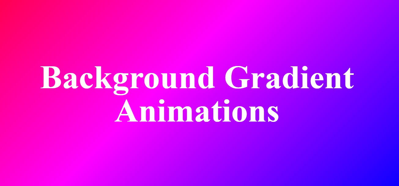
Background Gradient Color Animations
Chia sẻ
Cuối tuần custom tông màu Gradient cho anh em làm background và thêm chuyển động Slide
1. HTML
<div class="bg">
		<div class="section section1">
			<h1 class="title">Background Gradient Animations</h1>
		</div>
	</div>
2. CSS
@keyframes slide {
			0% {
				background-position-x: 0%;
			}
			100% {
				background-position-x: 600vw;
			}
		}
		*{
			margin: 0;
			padding: 0;
			border: 0;
		}
		body {
			font-family: 'filson-soft';
			margin: 0;
			overflow: hidden;
			color: white;
			text-align: center;
		}

		.bg{
			height: 800px;
			line-height: 400px;
		}

		.section1 {
			height: 100%;
			background: repeating-linear-gradient(-45deg, red 0%, yellow 7.14%, lime 14.28%, cyan 21.42%, cyan 28.56%, blue 35.7%, magenta 42.84%, red 50%);
			background-size: 600vw 600vw;
			-webkit-animation: 'slide' 10s infinite linear forwards;
			padding-top: 200px;
		}

		.title {
			font-size: 8vw;
			line-height: 8vw;
		}
3. JAVASCRIPT
Mong bài viết giúp ích được các bạn phần nào trong thiết kế Web. Hãy nhấn nút Chia sẻđể mọi người cùng học hỏi kiến thức mới nhé. Cảm ơn các bạn đã quan tâm Forum.