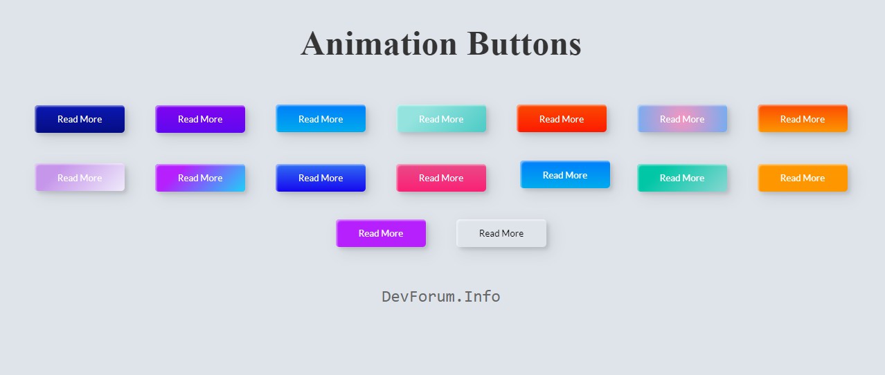
Candy Color Button Animation with HTML and CSS
Chia sẻ
DevForum chia sẻ các bạn mẫu code Button kiểu Candy với HTML và CSS
1. HTML
<header>
   <link href="https://fonts.googleapis.com/css2?family=Lato&display=swap" rel="stylesheet">
 </header>

 <h1>Animation Buttons</h1>

 <div class="frame">
  <button class="custom-btn btn-1">Read More</button>
  <button class="custom-btn btn-2">Read More</button>
  <button class="custom-btn btn-3"><span>Read More</span></button>
  <button class="custom-btn btn-4"><span>Read More</span></button>
  <button class="custom-btn btn-5"><span>Read More</span></button>
  <button class="custom-btn btn-6"><span>Read More</span></button>
  <button class="custom-btn btn-7"><span>Read More</span></button>
  <button class="custom-btn btn-8"><span>Read More</span></button>
  <button class="custom-btn btn-9">Read More</button>
  <button class="custom-btn btn-10">Read More</button>
  <button class="custom-btn btn-11">Read More<div class="dot"></div></button>
  <button class="custom-btn btn-12"><span>Click!</span><span>Read More</span></button>
  <button class="custom-btn btn-13">Read More</button>
  <button class="custom-btn btn-14">Read More</button>
  <button class="custom-btn btn-15">Read More</button>
  <button class="custom-btn btn-16">Read More</button>

  <br><br>
  <h2><a href="https://devforum.info" style="font-family: Andale Mono, monospace;">
  DevForum.Info</a></h2>
2. CSS
body {
    background: #e0e5ec;
  }
  h1 {
    position: relative;
    text-align: center;
    color: #353535;
    font-size: 50px;
    font-family: "Cormorant Garamond", serif;
  }

  a {
    font-family: 'Lato', sans-serif;
    font-weight: 300;
    text-align: center;
    color: #676767;
    text-decoration: none;
  }

  .frame {
    width: 90%;
    margin: 40px auto;
    text-align: center;
  }
  button {
    margin: 20px;
  }
  .custom-btn {
    width: 130px;
    height: 40px;
    color: #fff;
    border-radius: 5px;
    padding: 10px 25px;
    font-family: 'Lato', sans-serif;
    font-weight: 500;
    background: transparent;
    cursor: pointer;
    transition: all 0.3s ease;
    position: relative;
    display: inline-block;
    box-shadow:inset 2px 2px 2px 0px rgba(255,255,255,.5),
    7px 7px 20px 0px rgba(0,0,0,.1),
    4px 4px 5px 0px rgba(0,0,0,.1);
  }

  /* 1 */
  .btn-1 {
    background: rgb(6,14,131);
    background: linear-gradient(0deg, rgba(6,14,131,1) 0%, rgba(12,25,180,1) 100%);
    border: none;
  }
  .btn-1:hover {
   background: rgb(0,3,255);
   background: linear-gradient(0deg, rgba(0,3,255,1) 0%, rgba(2,126,251,1) 100%);
 }

 /* 2 */
 .btn-2 {
  background: rgb(96,9,240);
  background: linear-gradient(0deg, rgba(96,9,240,1) 0%, rgba(129,5,240,1) 100%);
  border: none;

}
.btn-2:before {
  height: 0%;
  width: 2px;
}
.btn-2:hover {
  box-shadow:  4px 4px 6px 0 rgba(255,255,255,.5),
  -4px -4px 6px 0 rgba(116, 125, 136, .5),
  inset -4px -4px 6px 0 rgba(255,255,255,.2),
  inset 4px 4px 6px 0 rgba(0, 0, 0, .4);
}


/* 3 */
.btn-3 {
  background: rgb(0,172,238);
  background: linear-gradient(0deg, rgba(0,172,238,1) 0%, rgba(2,126,251,1) 100%);
  width: 130px;
  height: 40px;
  line-height: 42px;
  padding: 0;
  border: none;

}
.btn-3 span {
  position: relative;
  display: block;
  width: 100%;
  height: 100%;
}
.btn-3:before,
.btn-3:after {
  position: absolute;
  content: "";
  right: 0;
  top: 0;
  background: rgba(2,126,251,1);
  transition: all 0.3s ease;
}
.btn-3:before {
  height: 0%;
  width: 2px;
}
.btn-3:after {
  width: 0%;
  height: 2px;
}
.btn-3:hover{
 background: transparent;
 box-shadow: none;
}
.btn-3:hover:before {
  height: 100%;
}
.btn-3:hover:after {
  width: 100%;
}
.btn-3 span:hover{
 color: rgba(2,126,251,1);
}
.btn-3 span:before,
.btn-3 span:after {
  position: absolute;
  content: "";
  left: 0;
  bottom: 0;
  background: rgba(2,126,251,1);
  transition: all 0.3s ease;
}
.btn-3 span:before {
  width: 2px;
  height: 0%;
}
.btn-3 span:after {
  width: 0%;
  height: 2px;
}
.btn-3 span:hover:before {
  height: 100%;
}
.btn-3 span:hover:after {
  width: 100%;
}

/* 4 */
.btn-4 {
  background-color: #4dccc6;
  background-image: linear-gradient(315deg, #4dccc6 0%, #96e4df 74%);
  line-height: 42px;
  padding: 0;
  border: none;
}
.btn-4:hover{
  background-color: #89d8d3;
  background-image: linear-gradient(315deg, #89d8d3 0%, #03c8a8 74%);
}
.btn-4 span {
  position: relative;
  display: block;
  width: 100%;
  height: 100%;
}
.btn-4:before,
.btn-4:after {
  position: absolute;
  content: "";
  right: 0;
  top: 0;
  box-shadow:  4px 4px 6px 0 rgba(255,255,255,.9),
  -4px -4px 6px 0 rgba(116, 125, 136, .2),
  inset -4px -4px 6px 0 rgba(255,255,255,.9),
  inset 4px 4px 6px 0 rgba(116, 125, 136, .3);
  transition: all 0.3s ease;
}
.btn-4:before {
  height: 0%;
  width: .1px;
}
.btn-4:after {
  width: 0%;
  height: .1px;
}
.btn-4:hover:before {
  height: 100%;
}
.btn-4:hover:after {
  width: 100%;
}
.btn-4 span:before,
.btn-4 span:after {
  position: absolute;
  content: "";
  left: 0;
  bottom: 0;
  box-shadow:  4px 4px 6px 0 rgba(255,255,255,.9),
  -4px -4px 6px 0 rgba(116, 125, 136, .2),
  inset -4px -4px 6px 0 rgba(255,255,255,.9),
  inset 4px 4px 6px 0 rgba(116, 125, 136, .3);
  transition: all 0.3s ease;
}
.btn-4 span:before {
  width: .1px;
  height: 0%;
}
.btn-4 span:after {
  width: 0%;
  height: .1px;
}
.btn-4 span:hover:before {
  height: 100%;
}
.btn-4 span:hover:after {
  width: 100%;
}

/* 5 */
.btn-5 {
  width: 130px;
  height: 40px;
  line-height: 42px;
  padding: 0;
  border: none;
  background: rgb(255,27,0);
  background: linear-gradient(0deg, rgba(255,27,0,1) 0%, rgba(251,75,2,1) 100%);
}
.btn-5:hover {
  color: #f0094a;
  background: transparent;
  box-shadow:none;
}
.btn-5:before,
.btn-5:after{
  content:'';
  position:absolute;
  top:0;
  right:0;
  height:2px;
  width:0;
  background: #f0094a;
  box-shadow:
  -1px -1px 5px 0px #fff,
  7px 7px 20px 0px #0003,
  4px 4px 5px 0px #0002;
  transition:400ms ease all;
}
.btn-5:after{
  right:inherit;
  top:inherit;
  left:0;
  bottom:0;
}
.btn-5:hover:before,
.btn-5:hover:after{
  width:100%;
  transition:800ms ease all;
}


/* 6 */
.btn-6 {
  background: rgb(247,150,192);
  background: radial-gradient(circle, rgba(247,150,192,1) 0%, rgba(118,174,241,1) 100%);
  line-height: 42px;
  padding: 0;
  border: none;
}
.btn-6 span {
  position: relative;
  display: block;
  width: 100%;
  height: 100%;
}
.btn-6:before,
.btn-6:after {
  position: absolute;
  content: "";
  height: 0%;
  width: 1px;
  box-shadow:
  -1px -1px 20px 0px rgba(255,255,255,1),
  -4px -4px 5px 0px rgba(255,255,255,1),
  7px 7px 20px 0px rgba(0,0,0,.4),
  4px 4px 5px 0px rgba(0,0,0,.3);
}
.btn-6:before {
  right: 0;
  top: 0;
  transition: all 500ms ease;
}
.btn-6:after {
  left: 0;
  bottom: 0;
  transition: all 500ms ease;
}
.btn-6:hover{
  background: transparent;
  color: #76aef1;
  box-shadow: none;
}
.btn-6:hover:before {
  transition: all 500ms ease;
  height: 100%;
}
.btn-6:hover:after {
  transition: all 500ms ease;
  height: 100%;
}
.btn-6 span:before,
.btn-6 span:after {
  position: absolute;
  content: "";
  box-shadow:
  -1px -1px 20px 0px rgba(255,255,255,1),
  -4px -4px 5px 0px rgba(255,255,255,1),
  7px 7px 20px 0px rgba(0,0,0,.4),
  4px 4px 5px 0px rgba(0,0,0,.3);
}
.btn-6 span:before {
  left: 0;
  top: 0;
  width: 0%;
  height: .5px;
  transition: all 500ms ease;
}
.btn-6 span:after {
  right: 0;
  bottom: 0;
  width: 0%;
  height: .5px;
  transition: all 500ms ease;
}
.btn-6 span:hover:before {
  width: 100%;
}
.btn-6 span:hover:after {
  width: 100%;
}

/* 7 */
.btn-7 {
  background: linear-gradient(0deg, rgba(255,151,0,1) 0%, rgba(251,75,2,1) 100%);
  line-height: 42px;
  padding: 0;
  border: none;
}
.btn-7 span {
  position: relative;
  display: block;
  width: 100%;
  height: 100%;
}
.btn-7:before,
.btn-7:after {
  position: absolute;
  content: "";
  right: 0;
  bottom: 0;
  background: rgba(251,75,2,1);
  box-shadow:
  -7px -7px 20px 0px rgba(255,255,255,.9),
  -4px -4px 5px 0px rgba(255,255,255,.9),
  7px 7px 20px 0px rgba(0,0,0,.2),
  4px 4px 5px 0px rgba(0,0,0,.3);
  transition: all 0.3s ease;
}
.btn-7:before{
 height: 0%;
 width: 2px;
}
.btn-7:after {
  width: 0%;
  height: 2px;
}
.btn-7:hover{
  color: rgba(251,75,2,1);
  background: transparent;
}
.btn-7:hover:before {
  height: 100%;
}
.btn-7:hover:after {
  width: 100%;
}
.btn-7 span:before,
.btn-7 span:after {
  position: absolute;
  content: "";
  left: 0;
  top: 0;
  background: rgba(251,75,2,1);
  box-shadow:
  -7px -7px 20px 0px rgba(255,255,255,.9),
  -4px -4px 5px 0px rgba(255,255,255,.9),
  7px 7px 20px 0px rgba(0,0,0,.2),
  4px 4px 5px 0px rgba(0,0,0,.3);
  transition: all 0.3s ease;
}
.btn-7 span:before {
  width: 2px;
  height: 0%;
}
.btn-7 span:after {
  height: 2px;
  width: 0%;
}
.btn-7 span:hover:before {
  height: 100%;
}
.btn-7 span:hover:after {
  width: 100%;
}

/* 8 */
.btn-8 {
  background-color: #f0ecfc;
  background-image: linear-gradient(315deg, #f0ecfc 0%, #c797eb 74%);
  line-height: 42px;
  padding: 0;
  border: none;
}
.btn-8 span {
  position: relative;
  display: block;
  width: 100%;
  height: 100%;
}
.btn-8:before,
.btn-8:after {
  position: absolute;
  content: "";
  right: 0;
  bottom: 0;
  background: #c797eb;
  /*box-shadow:  4px 4px 6px 0 rgba(255,255,255,.5),
              -4px -4px 6px 0 rgba(116, 125, 136, .2),
    inset -4px -4px 6px 0 rgba(255,255,255,.5),
    inset 4px 4px 6px 0 rgba(116, 125, 136, .3);*/
    transition: all 0.3s ease;
  }
  .btn-8:before{
   height: 0%;
   width: 2px;
 }
 .btn-8:after {
  width: 0%;
  height: 2px;
}
.btn-8:hover:before {
  height: 100%;
}
.btn-8:hover:after {
  width: 100%;
}
.btn-8:hover{
  background: transparent;
}
.btn-8 span:hover{
  color: #c797eb;
}
.btn-8 span:before,
.btn-8 span:after {
  position: absolute;
  content: "";
  left: 0;
  top: 0;
  background: #c797eb;
  /*box-shadow:  4px 4px 6px 0 rgba(255,255,255,.5),
              -4px -4px 6px 0 rgba(116, 125, 136, .2),
    inset -4px -4px 6px 0 rgba(255,255,255,.5),
    inset 4px 4px 6px 0 rgba(116, 125, 136, .3);*/
    transition: all 0.3s ease;
  }
  .btn-8 span:before {
    width: 2px;
    height: 0%;
  }
  .btn-8 span:after {
    height: 2px;
    width: 0%;
  }
  .btn-8 span:hover:before {
    height: 100%;
  }
  .btn-8 span:hover:after {
    width: 100%;
  }


  /* 9 */
  .btn-9 {
    border: none;
    transition: all 0.3s ease;
    overflow: hidden;
  }
  .btn-9:after {
    position: absolute;
    content: " ";
    z-index: -1;
    top: 0;
    left: 0;
    width: 100%;
    height: 100%;
    background-color: #1fd1f9;
    background-image: linear-gradient(315deg, #1fd1f9 0%, #b621fe 74%);
    transition: all 0.3s ease;
  }
  .btn-9:hover {
    background: transparent;
    box-shadow:  4px 4px 6px 0 rgba(255,255,255,.5),
    -4px -4px 6px 0 rgba(116, 125, 136, .2),
    inset -4px -4px 6px 0 rgba(255,255,255,.5),
    inset 4px 4px 6px 0 rgba(116, 125, 136, .3);
    color: #fff;
  }
  .btn-9:hover:after {
    -webkit-transform: scale(2) rotate(180deg);
    transform: scale(2) rotate(180deg);
    box-shadow:  4px 4px 6px 0 rgba(255,255,255,.5),
    -4px -4px 6px 0 rgba(116, 125, 136, .2),
    inset -4px -4px 6px 0 rgba(255,255,255,.5),
    inset 4px 4px 6px 0 rgba(116, 125, 136, .3);
  }

  /* 10 */
  .btn-10 {
    background: rgb(22,9,240);
    background: linear-gradient(0deg, rgba(22,9,240,1) 0%, rgba(49,110,244,1) 100%);
    color: #fff;
    border: none;
    transition: all 0.3s ease;
    overflow: hidden;
  }
  .btn-10:after {
    position: absolute;
    content: " ";
    top: 0;
    left: 0;
    z-index: -1;
    width: 100%;
    height: 100%;
    transition: all 0.3s ease;
    -webkit-transform: scale(.1);
    transform: scale(.1);
  }
  .btn-10:hover {
    color: #fff;
    border: none;
    background: transparent;
  }
  .btn-10:hover:after {
    background: rgb(0,3,255);
    background: linear-gradient(0deg, rgba(2,126,251,1) 0%,  rgba(0,3,255,1)100%);
    -webkit-transform: scale(1);
    transform: scale(1);
  }

  /* 11 */
  .btn-11 {
    border: none;
    background: rgb(251,33,117);
    background: linear-gradient(0deg, rgba(251,33,117,1) 0%, rgba(234,76,137,1) 100%);
    color: #fff;
    overflow: hidden;
  }
  .btn-11:hover {
    text-decoration: none;
    color: #fff;
  }
  .btn-11:before {
    position: absolute;
    content: '';
    display: inline-block;
    top: -180px;
    left: 0;
    width: 30px;
    height: 100%;
    background-color: #fff;
    animation: shiny-btn1 3s ease-in-out infinite;
  }
  .btn-11:hover{
    opacity: .7;
  }
  .btn-11:active{
    box-shadow:  4px 4px 6px 0 rgba(255,255,255,.3),
    -4px -4px 6px 0 rgba(116, 125, 136, .2),
    inset -4px -4px 6px 0 rgba(255,255,255,.2),
    inset 4px 4px 6px 0 rgba(0, 0, 0, .2);
  }


  @-webkit-keyframes shiny-btn1 {
    0% { -webkit-transform: scale(0) rotate(45deg); opacity: 0; }
    80% { -webkit-transform: scale(0) rotate(45deg); opacity: 0.5; }
    81% { -webkit-transform: scale(4) rotate(45deg); opacity: 1; }
    100% { -webkit-transform: scale(50) rotate(45deg); opacity: 0; }
  }


  /* 12 */
  .btn-12{
    position: relative;
    right: 20px;
    bottom: 20px;
    border:none;
    box-shadow: none;
    width: 130px;
    height: 40px;
    line-height: 42px;
    -webkit-perspective: 230px;
    perspective: 230px;
  }
  .btn-12 span {
    background: rgb(0,172,238);
    background: linear-gradient(0deg, rgba(0,172,238,1) 0%, rgba(2,126,251,1) 100%);
    display: block;
    position: absolute;
    width: 130px;
    height: 40px;
    box-shadow:inset 2px 2px 2px 0px rgba(255,255,255,.5),
    7px 7px 20px 0px rgba(0,0,0,.1),
    4px 4px 5px 0px rgba(0,0,0,.1);
    border-radius: 5px;
    margin:0;
    text-align: center;
    -webkit-box-sizing: border-box;
    -moz-box-sizing: border-box;
    box-sizing: border-box;
    -webkit-transition: all .3s;
    transition: all .3s;
  }
  .btn-12 span:nth-child(1) {
    box-shadow:
    -7px -7px 20px 0px #fff9,
    -4px -4px 5px 0px #fff9,
    7px 7px 20px 0px #0002,
    4px 4px 5px 0px #0001;
    -webkit-transform: rotateX(90deg);
    -moz-transform: rotateX(90deg);
    transform: rotateX(90deg);
    -webkit-transform-origin: 50% 50% -20px;
    -moz-transform-origin: 50% 50% -20px;
    transform-origin: 50% 50% -20px;
  }
  .btn-12 span:nth-child(2) {
    -webkit-transform: rotateX(0deg);
    -moz-transform: rotateX(0deg);
    transform: rotateX(0deg);
    -webkit-transform-origin: 50% 50% -20px;
    -moz-transform-origin: 50% 50% -20px;
    transform-origin: 50% 50% -20px;
  }
  .btn-12:hover span:nth-child(1) {
    box-shadow:inset 2px 2px 2px 0px rgba(255,255,255,.5),
    7px 7px 20px 0px rgba(0,0,0,.1),
    4px 4px 5px 0px rgba(0,0,0,.1);
    -webkit-transform: rotateX(0deg);
    -moz-transform: rotateX(0deg);
    transform: rotateX(0deg);
  }
  .btn-12:hover span:nth-child(2) {
    box-shadow:inset 2px 2px 2px 0px rgba(255,255,255,.5),
    7px 7px 20px 0px rgba(0,0,0,.1),
    4px 4px 5px 0px rgba(0,0,0,.1);
    color: transparent;
    -webkit-transform: rotateX(-90deg);
    -moz-transform: rotateX(-90deg);
    transform: rotateX(-90deg);
  }


  /* 13 */
  .btn-13 {
    background-color: #89d8d3;
    background-image: linear-gradient(315deg, #89d8d3 0%, #03c8a8 74%);
    border: none;
    z-index: 1;
  }
  .btn-13:after {
    position: absolute;
    content: "";
    width: 100%;
    height: 0;
    bottom: 0;
    left: 0;
    z-index: -1;
    border-radius: 5px;
    background-color: #4dccc6;
    background-image: linear-gradient(315deg, #4dccc6 0%, #96e4df 74%);
    box-shadow:
    -7px -7px 20px 0px #fff9,
    -4px -4px 5px 0px #fff9,
    7px 7px 20px 0px #0002,
    4px 4px 5px 0px #0001;
    transition: all 0.3s ease;
  }
  .btn-13:hover {
    color: #fff;
  }
  .btn-13:hover:after {
    top: 0;
    height: 100%;
  }
  .btn-13:active {
    top: 2px;
  }


  /* 14 */
  .btn-14 {
    background: rgb(255,151,0);
    border: none;
    z-index: 1;
  }
  .btn-14:after {
    position: absolute;
    content: "";
    width: 100%;
    height: 0;
    top: 0;
    left: 0;
    z-index: -1;
    border-radius: 5px;
    background-color: #eaf818;
    background-image: linear-gradient(315deg, #eaf818 0%, #f6fc9c 74%);
    box-shadow:inset 2px 2px 2px 0px rgba(255,255,255,.5);
    7px 7px 20px 0px rgba(0,0,0,.1),
    4px 4px 5px 0px rgba(0,0,0,.1);
    transition: all 0.3s ease;
  }
  .btn-14:hover {
    color: #000;
  }
  .btn-14:hover:after {
    top: auto;
    bottom: 0;
    height: 100%;
  }
  .btn-14:active {
    top: 2px;
  }

  /* 15 */
  .btn-15 {
    background: #b621fe;
    border: none;
    z-index: 1;
  }
  .btn-15:after {
    position: absolute;
    content: "";
    width: 0;
    height: 100%;
    top: 0;
    right: 0;
    z-index: -1;
    background-color: #663dff;
    border-radius: 5px;
    box-shadow:inset 2px 2px 2px 0px rgba(255,255,255,.5),
    7px 7px 20px 0px rgba(0,0,0,.1),
    4px 4px 5px 0px rgba(0,0,0,.1);
    transition: all 0.3s ease;
  }
  .btn-15:hover {
    color: #fff;
  }
  .btn-15:hover:after {
    left: 0;
    width: 100%;
  }
  .btn-15:active {
    top: 2px;
  }


  /* 16 */
  .btn-16 {
    border: none;
    color: #000;
  }
  .btn-16:after {
    position: absolute;
    content: "";
    width: 0;
    height: 100%;
    top: 0;
    left: 0;
    direction: rtl;
    z-index: -1;
    box-shadow:
    -7px -7px 20px 0px #fff9,
    -4px -4px 5px 0px #fff9,
    7px 7px 20px 0px #0002,
    4px 4px 5px 0px #0001;
    transition: all 0.3s ease;
  }
  .btn-16:hover {
    color: #000;
  }
  .btn-16:hover:after {
    left: auto;
    right: 0;
    width: 100%;
  }
  .btn-16:active {
    top: 2px;
  }
3. JAVASCRIPT
Mong bài viết giúp ích được các bạn phần nào trong thiết kế Web. Hãy nhấn nút Chia sẻđể mọi người cùng học hỏi kiến thức mới nhé. Cảm ơn các bạn đã quan tâm Forum.