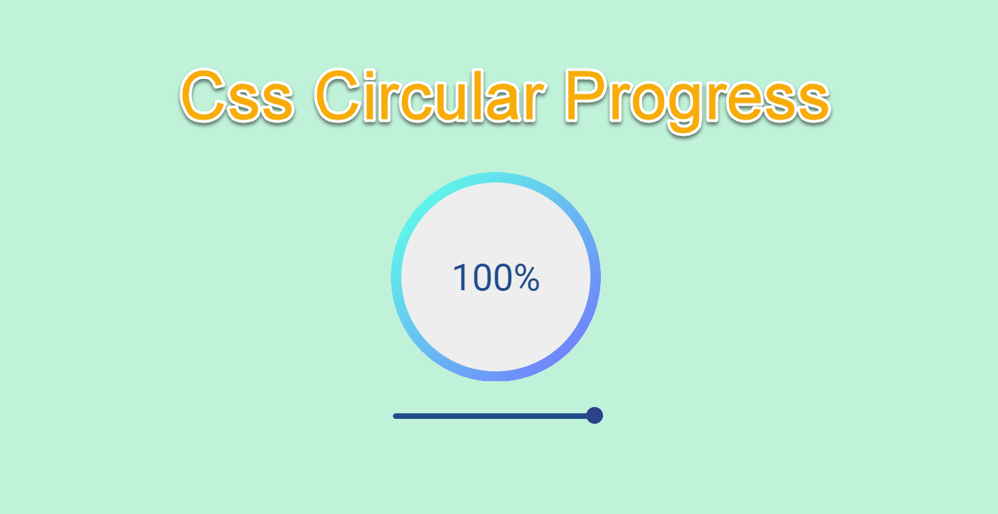
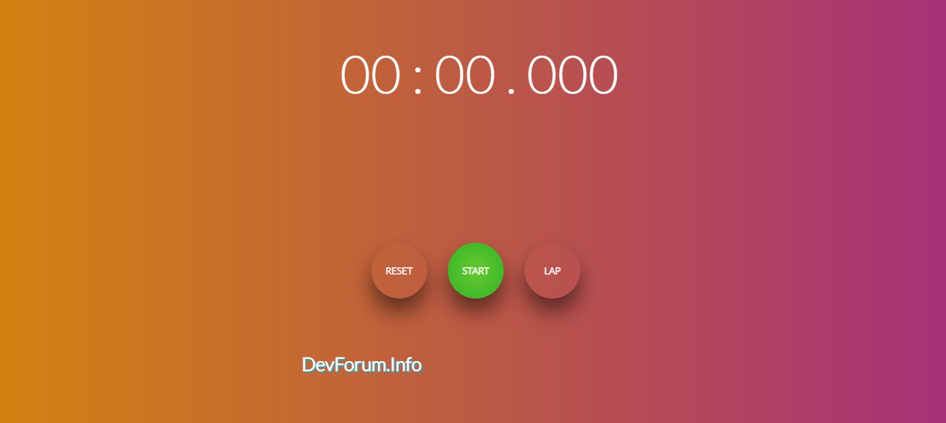
Circle Progress with Javascript
Chia sẻ
DevForum chia sẻ đến các bạn mẫu code làm thanh Progress vòng tròn bằng Javascript thuần.
1. HTML
<script src="https://cdnjs.cloudflare.com/ajax/libs/jquery/3.4.1/jquery.min.js" type="text/javascript"></script>

<div class="progress">
		<div class="precent">100%</div>
		<div class="circle"></div>
		<div class="range">
			<input type="range" min="0" max="100" value="100" id="range">
			<div class="filled"></div>
		</div>
	</div>
2. CSS
body {
			background: #eeeeee;
			font-family: Roboto;
		}
		.progress {
			width: 200px;
			height: 200px;
			position: absolute;
			top: 50%;
			left: 50%;
			transform: translate(-50%, -50%);
		}
		.progress:before {
			content: "";
			position: absolute;
			width: 180px;
			height: 180px;
			background: #eeeeee;
			border-radius: 100%;
			top: 50%;
			left: 50%;
			transform: translate(-50%, -50%);
			z-index: 99;
		}
		.progress .precent {
			position: absolute;
			top: 50%;
			left: 50%;
			z-index: 99;
			transform: translate(-50%, -50%);
			font-size: 35px;
			color: #214c8b;
		}
		.progress .circle {
			width: 200px;
			height: 200px;
			background-image: linear-gradient(135deg, #5efce8 10%, #736efe 100%);
			-webkit-clip-path: polygon(
				0% 100%,
				0% 0%,
				100% 0%,
				50% 50%,
				100% 0%,
				100% 100%
				);
			clip-path: polygon(0% 100%, 0% 0%, 100% 0%, 50% 50%, 100% 0%, 100% 100%);
			animation-name: loading;
			animation-duration: 5s;
			animation-iteration-count: infinite;
			animation-timing-function: cubic-bezier(0, 0.1, 0.9, 0.81);
			animation-play-state: paused;
			animation-direction: reverse;
			animation-delay: 5s;
			border-radius: 100%;
		}
		@keyframes loading {
			0% {
				-webkit-clip-path: polygon(
					0% 100%,
					0% 0%,
					100% 0%,
					50% 50%,
					100% 0%,
					100% 100%
					);
				clip-path: polygon(0% 100%, 0% 0%, 100% 0%, 50% 50%, 100% 0%, 100% 100%);
			}
			25% {
				-webkit-clip-path: polygon(
					0% 100%,
					0% 0%,
					100% 0%,
					50% 50%,
					100% 100%,
					100% 100%
					);
				clip-path: polygon(0% 100%, 0% 0%, 100% 0%, 50% 50%, 100% 100%, 100% 100%);
			}
			50% {
				-webkit-clip-path: polygon(
					0% 100%,
					0% 0%,
					100% 0%,
					50% 50%,
					0% 100%,
					0% 100%
					);
				clip-path: polygon(0% 100%, 0% 0%, 100% 0%, 50% 50%, 0% 100%, 0% 100%);
			}
			75% {
				-webkit-clip-path: polygon(0% 100%, 0% 0%, 100% 0%, 50% 50%, 0% 0%, 0% 0%);
				clip-path: polygon(0% 100%, 0% 0%, 100% 0%, 50% 50%, 0% 0%, 0% 0%);
			}
			100% {
				-webkit-clip-path: polygon(
					0% 100%,
					0% 0%,
					100% 0%,
					50% 50%,
					100% 0%,
					0% 0%
					);
				clip-path: polygon(0% 100%, 0% 0%, 100% 0%, 50% 50%, 100% 0%, 0% 0%);
			}
		}
		.progress .range {
			margin-top: 20px;
		}
		.progress input[type="range"] {
			-webkit-appearance: none;
			width: 100%;
			background: transparent;
		}

		.progress input[type="range"]::-webkit-slider-thumb {
			-webkit-appearance: none;
		}

		.progress input[type="range"]:focus {
			outline: none;
		}

		.progress input[type="range"]::-webkit-slider-thumb {
			-webkit-appearance: none;
			height: 16px;
			width: 16px;
			border-radius: 100%;
			background: #2a438a;
			cursor: pointer;
			margin-top: -6px;
			z-index: 9;
			position: relative;
		}

		.progress input[type="range"]::-moz-range-thumb {
			height: 16px;
			width: 16px;
			border-radius: 100%;
			background: #2a438a;
			cursor: pointer;
			border: 0;
			z-index: 9;
			position: relative;
		}

		.progress input[type="range"]::-webkit-slider-runnable-track {
			width: 100%;
			height: 5px;
			cursor: pointer;
			background: #214c8b;
			border-radius: 20px;
		}

		.progress input[type="range"]::-moz-range-track {
			width: 100%;
			height: 5px;
			cursor: pointer;
			background: #214c8b;
			border-radius: 20px;
		}
3. JAVASCRIPT
$(function () {
			var range = $("#range")[0];
			var percent = ((range.value - range.min) / (range.max - range.min)) * 5;
			var percentshow = Math.round(
				((range.value - range.min) / (range.max - range.min)) * 100
				);
			if (percent < 5) {
				$(".progress .circle").attr("style", "animation-delay:-" + percent + "s");
			} else {
				$(".progress .circle").attr("style", "animation-delay:5s");
			}
			$(".progress .precent").text(percentshow + "%");
			$(document).on("input", "#range", function () {
				var percent = ((this.value - this.min) / (this.max - this.min)) * 5;
				var percentshow = Math.round(
					((this.value - this.min) / (this.max - this.min)) * 100
					);
				if (percent < 5) {
					$(".progress .circle").attr("style", "animation-delay:-" + percent + "s");
				} else {
					$(".progress .circle").attr("style", "animation-delay:5s");
				}
				$(".progress .precent").text(percentshow + "%");
			});
		});
Mong bài viết giúp ích được các bạn phần nào trong thiết kế Web. Hãy nhấn nút Chia sẻđể mọi người cùng học hỏi kiến thức mới nhé. Cảm ơn các bạn đã quan tâm Forum.