Circle social share : Hiệu ứng vòng tròn với CSS3
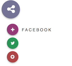
Chia sẻ
Khi chúng ta chia sẻ bài viết hoặc sản phẩm trên mạng xã hội thì lượt truy cập sẽ tăng đáng kể, và đó cũng là lí do mà mình sẽ thường xuyên cung cấp cho các bạn những mẫu social share mà các bạn có thể áp dụng cho website hay blog mà các bạn đang quản lý. Bài viết ngày hôm nay sẽ là một hiệu ứng vòng tròn không những gọn mà còn có thể đặt ở bất kì vị trí nào trên trang web, rất tiên lợi cho người dùng chia sẻ ngay nội dung hoặc sản phẩm mà họ muốn.
Các icons mà chúng ta sử dụng trong bài viết này là từ Font Awesome, vì vậy các bạn nên chèn font này ngay bên trong thẻ head.
Các icons mà chúng ta sử dụng trong bài viết này là từ Font Awesome, vì vậy các bạn nên chèn font này ngay bên trong thẻ head.
1. HTML
<div id="circle">
  <i class="icon1 fa fa-share-alt fa-lg"></i>
  <i class="icon2 fa fa-share-alt fa-lg"></i>
</div>
<div id="sub">
  <div id="circle">
    <i class="icon1 fa fa-facebook fa-lg"></i>
    <i class="icon2 fa fa-plus fa-lg"></i>
    <span><a href="#">Facebook</a></span>
  </div>
  <div id="circle">
    <i class="icon1 fa fa-twitter fa-lg"></i>
    <i class="icon2 fa fa-plus fa-lg"></i>
    <span><a href="#">Twitter</a></span>
  </div>
  <div id="circle">
    <i class="icon1 fa fa-google-plus fa-lg"></i>
    <i class="icon2 fa fa-plus fa-lg"></i>
    <span><a href="#">Google +</a></span>
  </div>
  </div>
2. CSS
#circle {
    width: 80px;
    height: 80px;
    border-radius: 50%;
    background: #747392;
    position: absolute;
    z-index:2;
    top: 25px;
    left: 25px;
    box-shadow: 0 0 4px rgba(0, 0, 0, .11), 0 4px 8px rgba(0, 0, 0, .22);
    cursor: pointer;
}
#circle:after {
    content:'';
    width: 10px;
    height: 10px;
    position: absolute;
    border-radius: 50%;
    background: rgba(81, 80, 122, 0.6);
    left: 35px;
    top: 35px;
}
#circle i {
    font-size: 40px;
    color: #fff;
    position: absolute;
    top: 24px;
    left: 24px;
    z-index: 1;
}
#circle i.icon1 {
    opacity: 1;
}
#circle i.icon2 {
    opacity: 0;
    top: 25px;
    left: 22px;
}
/* ANIMATION */
#circle, #circle i, #circle:after {
    -webkit-transition: all .2s cubic-bezier(.4, 0, .2, 1);
    transition: all .2s cubic-bezier(.4, 0, .2, 1);
}
/* HOVER */
#circle:hover {
    background: #626186;
    box-shadow: 0 0 4px rgba(0, 0, 0, .15), 0 4px 8px rgba(0, 0, 0, .30);
}
#circle:hover:after {
    width: 80px;
    height: 80px;
    left: 0;
    top: 0;
}
#circle:hover > i {
    -webkit-transform: rotate(720deg);
    transform: rotate(720deg);
}
#circle:hover > i.icon1 {
    opacity: 0;
}
#circle:hover > i.icon2 {
    opacity: 1;
}

/* ///// SUB CIRCLES ///// */
 #sub {
  width: 150px;
  height: 50%;
  z-index: 1;
  position: absolute;
  visibility:hidden;
}
#sub #circle {
    width: 50px;
    height: 50px;
    top: 0;
    left: 40px;
    opacity: 0;
    transition: 0.2s opacity;
}
#sub #circle:nth-child(1) {
    top: 120px;
    background: #95507f;
}
#sub #circle:nth-child(2) {
    top: 180px;
    background: #4e935c;
}
#sub #circle:nth-child(3) {
    top: 240px;
    background: #9f4b49;
}
#sub #circle:nth-child(1):after {
    background: rgba(126, 53, 108, 0.6);
}
#sub #circle:nth-child(2):after {
    background: rgba(49, 124, 61, 0.6);
}
#sub #circle:nth-child(3):after {
    background: rgba(135, 43, 45, 0.6);
}
#sub #circle:after {
    left: 20px;
    top: 20px;
}
#sub #circle i {
    font-size: 20px;
    top: 18px;
    left: 16px;
}
#sub #circle i.icon1 {
    opacity: 1;
}
#sub #circle i.icon2 {
    opacity: 0;
}
/* HOVER */
#sub #circle:hover:after {
    width: 50px;
    height: 50px;
    left: 0;
    top: 0;
}
#circle:hover + #sub #circle:nth-child(1) {
    opacity:1;
    transition-delay:0.05s;
}
#circle:hover + #sub #circle:nth-child(2) {
    opacity:1;
    transition-delay:0.1s;
}
#circle:hover + #sub #circle:nth-child(3) {
    opacity:1;
    transition-delay:0.15s;
}
#sub #circle:hover > i {
    -webkit-transform: rotate(90deg);
    transform: rotate(90deg);
}
#sub #circle:hover > i.icon1 {
    opacity: 0;
}
#sub #circle:hover > i.icon2 {
    opacity: 1;
}
#circle:hover + #sub {
visibility:visible;
}
#sub:hover {
visibility:visible;
}
#sub:hover > #circle {
    opacity:1;
}
/* ///// SUB TITLES ///// */
#circle span a{
  display: block;
  margin-right: -150px;
  margin-top: 16px;
  color: rgba(0, 0, 0,0.7);
  font-family: 'Comfortaa', sans-serif;
  text-transform: uppercase;
  font-weight: 400;
  text-align: left;
  padding-left: 60px;
  font-size: 1.1em;
  letter-spacing: 0.25em;
  opacity: 0;
  -webkit-transition: all .4s cubic-bezier(.4, 0, .2, 2);
  transition: all .4s cubic-bezier(.4, 0, .2, 2);
  text-decoration-line: none;
}
/* HOVER */
#sub #circle:hover > span a{
    opacity: 1;
    padding-left: 65px;
}
3. JAVASCRIPT
Mong bài viết giúp ích được các bạn phần nào trong thiết kế Web. Hãy nhấn nút Chia sẻđể mọi người cùng học hỏi kiến thức mới nhé. Cảm ơn các bạn đã quan tâm Forum.