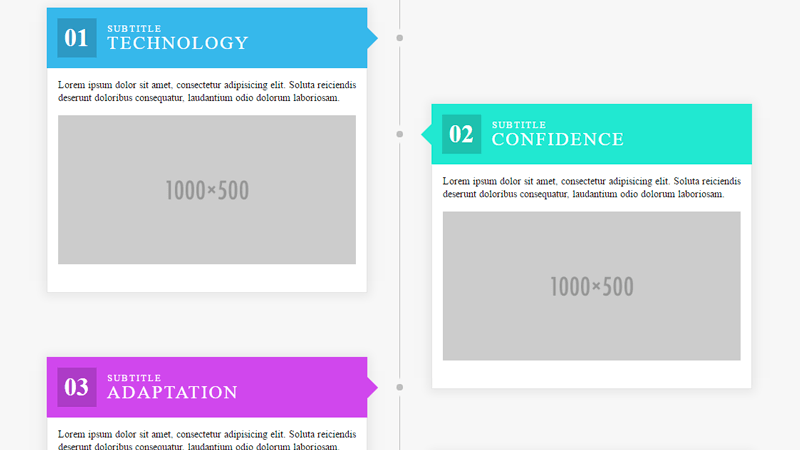
Flexbox Timeline Layout
Chia sẻ
Bố trí dòng thời gian flexbox dựa trên cột. Mục tiêu là để có HTML rõ ràng, ngữ nghĩa trong khi tạo bố cục theo thời gian
1. HTML
<section id=timeline>
	<h1>A Flexbox Timeline</h1>
	<p class="leader">All cards must be the same height and width for space calculations on large screens.</p>
	<div class="demo-card-wrapper">
		<div class="demo-card demo-card--step1">
			<div class="head">
				<div class="number-box">
					<span>01</span>
				</div>
				<h2><span class="small">Subtitle</span> Technology</h2>
			</div>
			<div class="body">
				<p>Lorem ipsum dolor sit amet, consectetur adipisicing elit. Soluta reiciendis deserunt doloribus consequatur, laudantium odio dolorum laboriosam.</p>
				<img src="http://placehold.it/1000x500" alt="Graphic">
			</div>
		</div>

		<div class="demo-card demo-card--step2">
			<div class="head">
				<div class="number-box">
					<span>02</span>
				</div>
				<h2><span class="small">Subtitle</span> Confidence</h2>
			</div>
			<div class="body">
				<p>Lorem ipsum dolor sit amet, consectetur adipisicing elit. Soluta reiciendis deserunt doloribus consequatur, laudantium odio dolorum laboriosam.</p>
				<img src="http://placehold.it/1000x500" alt="Graphic">
			</div>
		</div>

		<div class="demo-card demo-card--step3">
			<div class="head">
				<div class="number-box">
					<span>03</span>
				</div>
				<h2><span class="small">Subtitle</span> Adaptation</h2>
			</div>
			<div class="body">
				<p>Lorem ipsum dolor sit amet, consectetur adipisicing elit. Soluta reiciendis deserunt doloribus consequatur, laudantium odio dolorum laboriosam.</p>
				<img src="http://placehold.it/1000x500" alt="Graphic">
			</div>
		</div>

		<div class="demo-card demo-card--step4">
			<div class="head">
				<div class="number-box">
					<span>04</span>
				</div>
				<h2><span class="small">Subtitle</span> Consistency</h2>
			</div>
			<div class="body">
				<p>Lorem ipsum dolor sit amet, consectetur adipisicing elit. Soluta reiciendis deserunt doloribus consequatur, laudantium odio dolorum laboriosam.</p>
				<img src="http://placehold.it/1000x500" alt="Graphic">
			</div>
		</div>

		<div class="demo-card demo-card--step5">
			<div class="head">
				<div class="number-box">
					<span>05</span>
				</div>
				<h2><span class="small">Subtitle</span> Conversion</h2>
			</div>
			<div class="body">
				<p>Lorem ipsum dolor sit amet, consectetur adipisicing elit. Soluta reiciendis deserunt doloribus consequatur, laudantium odio dolorum laboriosam.</p>
				<img src="http://placehold.it/1000x500" alt="Graphic">
			</div>
		</div>

	</div>
</section>
2. CSS
/* SCSS nhe anh em */

/* Media Queries */

@mixin mq-xs {
  @media (min-width: 320px) {
    @content;
  }
}

@mixin mq-sm {
  @media (min-width: 480px) {
    @content;
  }
}

@mixin mq-md {
  @media (min-width: 720px) {
    @content;
  }
}

@mixin mq-lg {
  @media (min-width: 1000px) {
    @content;
  }
}

$background: #f7f7f7;
$box-shadow: 0px 1px 22px 4px rgba(0, 0, 0, 0.07);
$border: 1px solid rgba(191, 191, 191, 0.4);
$items: 5;
$rows: ceil($items/2);

/* Card sizing */

$card-height: 400px;
$card-width: 450px;
$inner-margin: 15px;
$number-size: 35px;
$stagger: 180px;
$outer-margin: 90px;
$marker-size: 9px;

/* Colors */

$steps: #46b8e9;
$colors: #46b8e9,
#3ee9d1,
#ce43eb,
#4d92eb;
$timeline: #bdbdbd;

/* Calculations */

$container-height: $rows * ($card-height + $outer-margin) + $stagger;
$container-width: $card-width*2 + $outer-margin*3;
$head-height: $number-size + 50;
$body-height: $card-height - $head-height;
$marker-dist: $card-width + $outer-margin/2 - $marker-size/2;

/* Placeholders */

@include mq-lg {
  %arrow {
    position: absolute;
    content: "";
    width: 0;
    height: 0;
    border-top: 15px solid transparent;
    border-bottom: 15px solid transparent;
  }
  %marker {
    position: absolute;
    content: "";
    width: $marker-size;
    height: $marker-size;
    background-color: $timeline;
    border-radius: $marker-size;
    box-shadow: 0px 0px 2px 8px $background;
  }
}


/* Some Cool Stuff */

$counter: $items - $rows + 2;
@for $i from 1 through $rows {
  .demo-card:nth-child(#{$i*2-1})   { order: $i }
  .demo-card:nth-child(#{$i*2})     { order: $counter }
  $counter: $counter + 1;
}

/* Border Box */

* {
  box-sizing: border-box;
}

/* Fonts */

body {
  font-family: Roboto;
}

#timeline {
  padding: 100px 0;
  background: $background;
  border-top: $border;
  border-bottom: $border;
  h1 {
    text-align: center;
    font-size: 3rem;
    font-weight: 200;
    margin-bottom: 20px;
  }
  p.leader {
    text-align: center;
    max-width: 90%;
    margin: auto;
    margin-bottom: 45px;
  }
  .demo-card-wrapper {
    position: relative;
    margin: auto;
    @include mq-lg {
      display: flex;
      flex-flow: column wrap;
      width: $container-width;
      height: $container-height;
      margin: 0 auto;
    }
    &::after {
      z-index: 1;
      content: "";
      position: absolute;
      top: 0;
      bottom: 0;
      left: 50%;
      border-left: $border;
      @include mq-lg {
        border-left: 1px solid $timeline;
      }
    }
  }
  .demo-card {
    position: relative;
    display: block;
    margin: 10px auto 80px;
    max-width: 94%;
    z-index: 2;
    @include mq-sm {
      max-width: 60%;
      box-shadow: $box-shadow;
    }
    @include mq-md {
      max-width: 40%;
    }
    @include mq-lg {
      max-width: $card-width;
      height: $card-height;
      margin: $outer-margin;
      margin-top: $outer-margin/2;
      margin-bottom: $outer-margin/2;
      &:nth-child(odd) {
        margin-right: $outer-margin/2;
        .head::after {
          @extend %arrow;
          border-left-width: 15px;
          border-left-style: solid;
          left: 100%;
        }
        .head::before {
          @extend %marker;
          left: $marker-dist + 1;
        }
      }
      &:nth-child(even) {
        margin-left: $outer-margin/2;
        .head::after {
          @extend %arrow;
          border-right-width: 15px;
          border-right-style: solid;
          right: 100%;
        }
        .head::before {
          @extend %marker;
          right: $marker-dist - 1;
        }
      }
      &:nth-child(2) {
        margin-top: $stagger;
      }
    }
    .head {
      position: relative;
      display: flex;
      align-items: center;
      color: #fff;
      font-weight: 400;
      .number-box {
        display: inline;
        float: left;
        margin: $inner-margin;
        padding: 10px;
        font-size: $number-size;
        line-height: $number-size;
        font-weight: 600;
        background: rgba(0, 0, 0, 0.17);
      }
      h2 {
        text-transform: uppercase;
        font-size: 1.3rem;
        font-weight: inherit;
        letter-spacing: 2px;
        margin: 0;
        padding-bottom: 6px;
        line-height: 1rem;
        @include mq-sm {
          font-size: 165%;
          line-height: 1.2rem;
        }
        span {
          display: block;
          font-size: 0.6rem;
          margin: 0;
          @include mq-sm {
            font-size: 0.8rem;
          }
        }
      }
    }
    .body {
      background: #fff;
      border: $border;
      border-top: 0;
      padding: $inner-margin;
      @include mq-lg {
        height: $body-height;
      }
      p {
        font-size: 14px;
        line-height: 18px;
        margin-bottom: $inner-margin;
      }
      img {
        display: block;
        width: 100%;
      }
    }
    @for $i from 1 through $items {
      &--step#{$i} {
        $color: nth($colors, ((($i - 1) % 4) + 1));
        background-color: $color;
        .head::after {
          border-color: $color;
        }
      }
    }
  }
}
3. JAVASCRIPT
Mong bài viết giúp ích được các bạn phần nào trong thiết kế Web. Hãy nhấn nút Chia sẻđể mọi người cùng học hỏi kiến thức mới nhé. Cảm ơn các bạn đã quan tâm Forum.