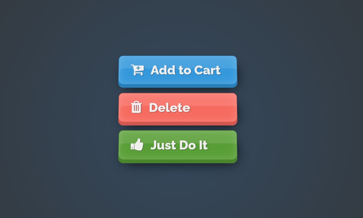
Glossy Button with CSS
Chia sẻ
DevForum chia sẻ code làm Button kiểu Glossy (bóng) chỉ với CSS
1. HTML
<div class="container">
        <button>
          <i class="fa fa-cart-plus"></i>Add to Cart
        </button>
        <br />
        <button class="red">
          <i class="fa fa-trash"></i>Delete
        </button>
        <br />
        <button class="green">
          <i class="fa fa-thumbs-up"></i>Just Do It
        </button>
    </div>
2. CSS
@import url("https://fonts.googleapis.com/css?family=Raleway:800");
@import url("https://maxcdn.bootstrapcdn.com/font-awesome/4.4.0/css/font-awesome.min.css");

* {
            margin: 0;
            padding: 0;
            border: none;
            outline: none;
            transition: all 0.15s;
        }

        html {
            height: 100%;
        }

        body {
            position: absolute;
            top: 0;
            bottom: 0;
            right: 0;
            left: 0;
            background: radial-gradient(circle, #34495e 0%, #333 100%);
            padding-top: 50px;
        }

        .container {
            margin: 100px auto;
            text-align: center;
            perspective: 600px;
        }

        button {
            font-size: 30px;
            font-family: Raleway;
            line-height: 30px;
            padding: .618em 1em;
            border-radius: 10px 10px 12px 12px;
            box-shadow: 0px 8px 0px 0px #2980b9, /* button thickness */
            0px 0 20px rgba(255, 255, 255, .2) inset, /* inner glow */
            2px 30px 0px rgba(255, 255, 255, .1) inset, /* sublte reflection */
            5px 15px 30px -10px #000;
            /* dark shadow underneath */
            border: 1px solid #2980b9;
            cursor: pointer;
            background: #3498db;
            color: #ecf0f1;
            text-shadow: 1px 1px 1px #34495e;
            transform: rotateX(5deg);
            margin: 10px 10px;
            width: 280px;
            text-align: left;
        }

        button i {
            padding-right: 17px;
            transform: scale(1.1) translate(0, -1px);
        }

        button:hover {
            margin-top: 15px;
            margin-bottom: 5px;
            box-shadow: 0px 5px 0px 0px #2980b9, /* button thickness */
            0px 0 50px rgba(134, 243, 255, 1) inset, /* inner glow */
            5px 28px 0px rgba(255, 255, 255, .15) inset, /* sublte reflection */
            0px 0px 30px rgba(134, 243, 255, .2), /* outer glow */
            5px 15px 30px -10px #000;
            /* dark shadow underneath */
            color: #fff;
            filter: saturate(1.5);
        }

        button:hover i {
            transform: rotate(-12deg) translate(1px, -3px) scale(1.2);
        }

        button:active {
            margin-top: 18px;
            margin-bottom: 2px;
            box-shadow: 0px 2px 0px 0px #2980b9, /* button thickness */
            0px 0 100px 10px rgba(134, 243, 255, 1) inset, /* inner glow */
            5px 25px 0px rgba(255, 255, 255, .1) inset, /* sublte reflection */
            0px 0px 30px rgba(134, 243, 255, .5), /* outer glow */
            5px 15px 30px -10px #000;
            /* dark shadow underneath */
            filter: saturate(1.7);
        }

        button:active i {
            transform: rotate(-22deg) translate(2px, -5px) scale(1.3);
        }

        .red {
            filter: hue-rotate(155deg);
        }

        .red:hover {
            filter: hue-rotate(155deg) saturate(1.5);
        }

        .red:active {
            filter: hue-rotate(155deg) saturate(1.7);
        }

        .green {
            filter: hue-rotate(255deg) saturate(.8);
        }

        .green:hover {
            filter: hue-rotate(255deg) saturate(1);
        }

        .green:active {
            filter: hue-rotate(255deg) saturate(1.2);
        }
3. JAVASCRIPT
Mong bài viết giúp ích được các bạn phần nào trong thiết kế Web. Hãy nhấn nút Chia sẻđể mọi người cùng học hỏi kiến thức mới nhé. Cảm ơn các bạn đã quan tâm Forum.