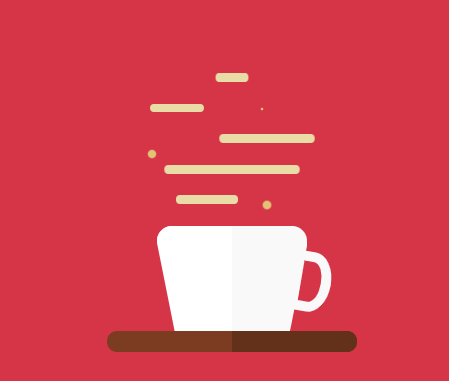
Hiệu ứng ly Cafe đẹp với HTML và CSS
Chia sẻ
Chia sẻ code ly Cafe với hiệu ứng cực đẹp và đơn giản chỉ với HTML và CSS
1. HTML
<div class="container">
		<div class="steamContainer">
			<div class="steam1"></div>
			<div class="steams">
				<div class="steam2"></div>
				<div class="bubble2"></div>
			</div>
			<div class="steams">
				<div class="steam3"></div>
				<div class="bubble3"></div>
			</div>
			<div class="steam4"></div>
			<div class="steams">
				<div class="steam5"></div>
				<div class="bubble5"></div>
			</div>
		</div>
		<div class="cup"></div>
		<div class="halfCup"></div>
		<div class="handle"></div>
		<div class="coaster"></div>
	</div>
2. CSS
* {
    margin: 0;
    padding: 0;
    box-sizing: border-box;
}

body {
    height: 100vh;
    background-color: #d63447;
    display: flex;
}

.container {
    margin: auto;
    width: 250px;
    height: 350px;
    display: flex;
    flex-direction: column;
    justify-content: flex-end;
    align-items: center;
    position: relative;
}

.coaster {
    width: 100%;
    height: 6%;
    background-color: #7c3c21;
    border-radius: 10px;
    position: relative;
}

.coaster::after {
    content: "";
    width: 50%;
    height: 100%;
    background-color: #63301a;
    position: absolute;
    right: 0;
    border-radius: 0 10px 10px 0;
}

.halfCup {
    height: 30%;
    width: 30%;
    background-color: white;
    position: absolute;
    bottom: 21px;
    left: 50px;
    border-radius: 15px 0 0 0;
}

.halfCup::after {
    content: "";
    width: 0;
    height: 0;
    border-bottom: 100px solid #d63447;
    border-right: 20px solid transparent;
}

.cup {
    width: 60%;
    height: 30%;
    background-color: #f9f9f9;
    border-radius: 15px 15px 0 0;
    position: relative;

}

.cup::before {
    content: "";
    width: 0;
    height: 0;
    border-bottom: 100px solid #d63447;
    border-left: 20px solid transparent;
    position: absolute;
    right: -3px;
    bottom: 0;
}

.handle {
    height: 60px;
    width: 40px;
    border-radius: 0 50% 50% 0;
    background-color: #d63447;
    border: 10px solid #f9f9f9;
    position: absolute;
    right: 26px;
    bottom: 40px;
    transform: rotate(10deg);
}

.steamContainer {
    width: 80%;
    height: 50%;
    display: flex;
    flex-direction: column;
    justify-content: space-evenly;
}

.steam1, .steam2, .steam3, .steam4, .steam5 {
    width: 20%;
    height: 5%;
    background-color: #eadca6;
    border-radius: 10px;
    animation: steamFloating 1.5s infinite linear;
}

.steam1 {
    align-self: center;
    animation-delay: 1.3s;
}

.steam2 {
    width: 30%;
    height: 100%;
    animation-delay: 1s;
    position: relative;
    right: 50px;
}

.steam3 {
    width: 50%;
    height: 100%;
    animation-delay: 0.8s;
    position: relative;
    left: 40px;
}

.steam4 {
    width: 70%;
    align-self: center;
    animation-delay: 0.5s;
}

.steam5 {
    width: 35%;
    height: 100%;
    animation-delay: 0.2s;
    position: relative;
    right: 20px;
}

.steams {
    width: 200px;
    height: 5%;
    display: flex;
    justify-content: center;
}

.bubble2, .bubble3, .bubble5 {
    width: 10px;
    height: 10px;
    border-radius: 50%;
    background-color: #e2c275;
    animation: bubbleFloating 1.5s infinite ease-in;
    position: relative;
}

.bubble3 {
    top: 15px;
    right: 130px;
    animation-delay: 0.7s;
}

.bubble5 {
    top: 5px;
    animation-delay: 0.4s;
}

@keyframes steamFloating {
    0% {
        transform: scaleX(1);
    }
    50% {
        transform: scaleX(0.8);
    }
    100% {
        transform: scaleX(1);
    }
}

@keyframes bubbleFloating {
    0% {
        transform: scale(1)
    }
    50% {
        transform: scale(0);
    }
    100% {
        transform: scale(1);
    }
}
3. JAVASCRIPT
Mong bài viết giúp ích được các bạn phần nào trong thiết kế Web. Hãy nhấn nút Chia sẻđể mọi người cùng học hỏi kiến thức mới nhé. Cảm ơn các bạn đã quan tâm Forum.