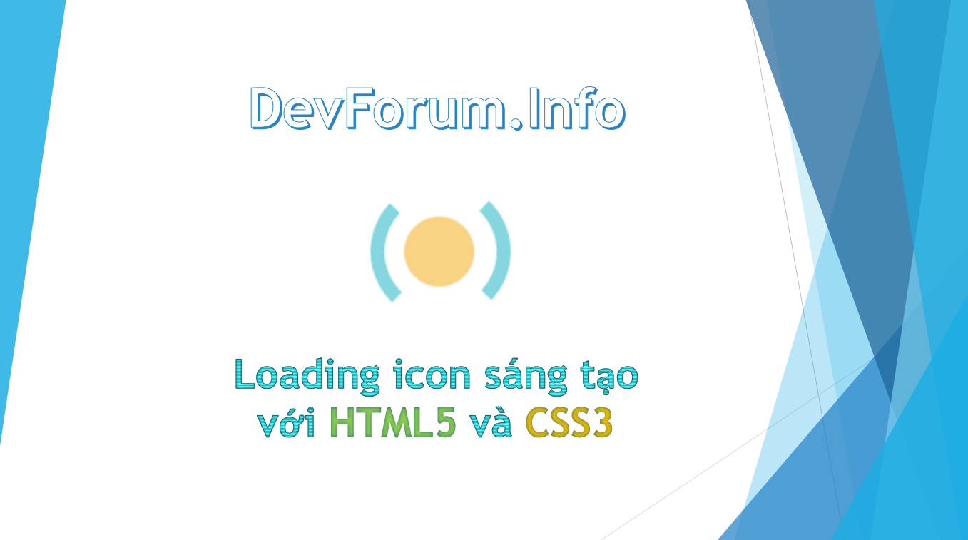
Loading icon sáng tạo với HTML5 và CSS3
Chia sẻ
Hôm nay DevForum sẽ mang đến cho các bạn thêm một mẫu Loading rất dễ làm với sự kết hợp hoàn hảo giữa HTML5 và CSS3. Qua bài viết này, các bạn sẽ hiểu được cách tạo các hiệu ứng động đơn giản bằng CSS3 và có thể áp dụng hiệu ứng này ngay cho website hay blog mà các bạn đang quản lý.
1. HTML
<div class="animationload">
	<div class="osahanloading"></div>
</div>
2. CSS
*, ::after, ::before {
			box-sizing: content-box;
		}
		.animationload {
			background-color: #fff;
			height: 100%;
			left: 0;
			position: fixed;
			top: 0;
			width: 100%;
			z-index: 10000;
		}
		.osahanloading {
			animation: 1.5s linear 0s normal none infinite running osahanloading;
			background: #fed37f none repeat scroll 0 0;
			border-radius: 50px;
			height: 50px;
			left: 50%;
			margin-left: -25px;
			margin-top: -25px;
			position: absolute;
			top: 50%;
			width: 50px;
		}

		.osahanloading::after {
			animation: 1.5s linear 0s normal none infinite running osahanloading_after;
			border-color: #85d6de transparent;
			border-radius: 80px;
			border-style: solid;
			border-width: 10px;
			content: "";
			height: 80px;
			left: -25px;
			position: absolute;
			top: -26px;
			width: 80px;
		}

		@keyframes osahanloading {
			0% {
				transform: rotate(0deg);
			}
			50% {
				background: #85d6de none repeat scroll 0 0;
				transform: rotate(180deg);
			}
			100% {
				transform: rotate(360deg);
			}
		}
3. JAVASCRIPT
Mong bài viết giúp ích được các bạn phần nào trong thiết kế Web. Hãy nhấn nút Chia sẻđể mọi người cùng học hỏi kiến thức mới nhé. Cảm ơn các bạn đã quan tâm Forum.