Mẫu Card Chiến Binh Responsive với HTML và CSS
Chia sẻ
Chia sẻ anh em mẫu Card với kiểu Chiến Binh thế giới đã Responsive chỉ với HTML và CSS
1. HTML
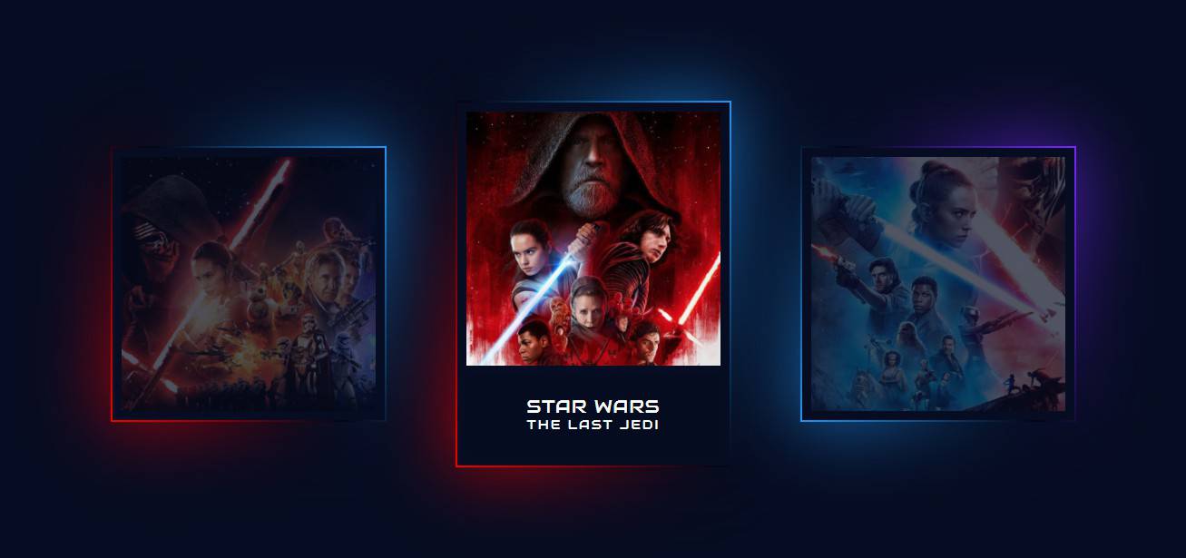
<div class="box">
   <div class="imgBx">
     <img src="http://samuel-garcia.site/img/the-force.png" alt="STAR-WARS-THE-FORCE">
   </div>
   <div class="content">
     <h2>STAR WARS<br><span>the force awakens</span></h2>
   </div>
 </div>

 <div class="box">
   <div class="imgBx">
     <img src="http://samuel-garcia.site/img/last-jedi.png" alt="Last-Jedi">
   </div>
   <div class="content">
     <h2>STAR WARS<br><span>the last jedi</span></h2>
   </div>
 </div>

 <div class="box">
   <div class="imgBx">
     <img src="http://samuel-garcia.site/img/the-rise.png" alt="STAR-WARS-The-Skywalker">
   </div>
   <div class="content">
     <h2>STAR WARS<br><span>rise of skywalker</span></h2>
   </div>
 </div>
2. CSS
@charset "UTF-8";
  @import url("https://fonts.googleapis.com/css2?family=Audiowide&display=swap");
  * {
    margin: 0;
    padding: 0;
    box-sizing: border-box;
    font-family: 'Audiowide', cursive;
  }

  body {
    display: flex;
    justify-content: center;
    align-items: center;
    flex-wrap: wrap;
    min-height: 100vh;
    background: #060c21;
  }

  .box {
    position: relative;
    width: 300px;
    height: 300px;
    display: flex;
    justify-content: center;
    align-items: center;
    margin: 40px;
    background: #060c21;
    /* Change */
    transition: .5s;
  }

  .box:hover {
    height: 400px;
  }

  .box .imgBx {
    position: absolute;
    top: 0;
    left: 0;
    width: 100%;
    height: 100%;
    padding: 10px;
    box-sizing: border-box;
  }

  .box .imgBx img {
    max-width: 100%;
    opacity: .3;
    transition: .5s;
  }

  .box:hover .imgBx img {
    opacity: 1;
  }

  .box:before {
    content: "";
    position: absolute;
    top: -2px;
    left: -2px;
    right: -2px;
    bottom: -2px;
    background: #fff;
    z-index: -1;
  }

  .box:after {
    content: "";
    position: absolute;
    top: -2px;
    left: -2px;
    right: -2px;
    bottom: -2px;
    background: #fff;
    z-index: -2;
    filter: blur(40px);
  }

  .box:before,
  .box:after {
    background: linear-gradient(235deg, #2196f3, #010615, #F00000);
  }

  .box:nth-child(2):before,
  .box:nth-child(2):after {
    /* not supported 😣 */
    background: linear-gradient(235deg, #2196f3, #010615, #F00000);
  }

  .box:nth-child(3):before,
  .box:nth-child(3):after {
    /* not supported 😣 */
    background: linear-gradient(235deg, #772aff, #010615, #2196f3);
  }

  .box .content {
    position: absolute;
    bottom: 0;
    left: 10px;
    right: 10px;
    bottom: 10px;
    height: 90px;
    background: rgba(0, 0, 0, 0.04);
    display: flex;
    justify-content: center;
    align-items: center;
    opacity: 0;
    transition: 0.5s;
  }

  .box:hover .content {
    opacity: 1;
  }

  .box .content h2 {
    font-size: 20px;
    color: #fff;
    font-weight: 500;
    /* just one style 😐 */
    line-height: 20px;
    letter-spacing: 1px;
    text-transform: uppercase;
  }

  .box .content h2 span {
    font-size: 14px;
    color: #fff;
    font-weight: 200;
    /* just one style 😐 */
    letter-spacing: 2px;
  }
3. JAVASCRIPT
Mong bài viết giúp ích được các bạn phần nào trong thiết kế Web. Hãy nhấn nút Chia sẻđể mọi người cùng học hỏi kiến thức mới nhé. Cảm ơn các bạn đã quan tâm Forum.