Mẫu code Ribbons 8
Chia sẻ
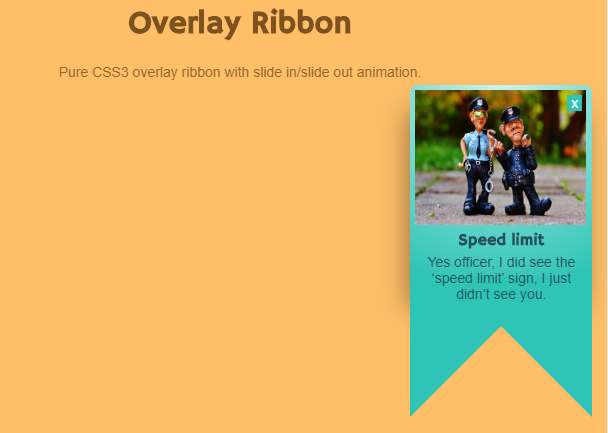
Overlay Ribbon (Animation Down)
1. HTML
<h1>Overlay Ribbon</h1>

<p>Pure CSS3 overlay ribbon with slide in/slide out animation.</p>

<div class="overlay-ribbon">
  <div class="ribbon-content">
    <span id="close" class="close-x"><a href="#">x</a></span>
    <div class="img-container"><img src="https://pixabay.com/static/uploads/photo/2015/10/31/21/02/cop-1016218_960_720.jpg" width="171" height="135" alt="" /></div>
    <h3>Speed limit</h3>
    <p>Yes officer, I did see the ‘speed limit’ sign, I just didn’t see you.</p>
  </div>
</div>
2. CSS
@import url(https://fonts.googleapis.com/css?family=Hammersmith+One);
html,
body {
  width: 100%;
  height: 100%;
}

body {
  font-size: 87.5%;
  font-family: Arial, sans-serif;
  background: #ffbf69;
}

h1 {
  text-align: center;
  font-family: 'Hammersmith One', sans-serif;
  color: #7d521e;
  font-size:32px;
}

p {
  text-align: center;
  color: #966429;
}
/*  Overlay Banner */
/*  ---------------------------------------------------- */

.overlay-ribbon {
  position: absolute;
  width: 13em;
  height: 14em;
  z-index: 9999;
  top: 0;
  right: 2%;
  background: #2ec4b6;
  padding: 5px 0;
  /* IE10 Consumer Preview */

  background-image: -ms-radial-gradient(center top, circle farthest-side, #cbf3f0 0%, #2ec4b6 100%);
  /* Mozilla Firefox */

  background-image: -moz-radial-gradient(center top, circle farthest-side, #cbf3f0 0%, #2ec4b6 100%);
  /* Opera */

  background-image: -o-radial-gradient(center top, circle farthest-side, #cbf3f0 0%, #2ec4b6 100%);
  /* Webkit (Safari/Chrome 10) */

  background-image: -webkit-gradient(radial, center top, 0, center top, 487, color-stop(0, #cbf3f0), color-stop(1, #2ec4b6));
  /* Webkit (Chrome 11+) */

  background-image: -webkit-radial-gradient(center top, circle farthest-side, #cbf3f0 0%, #2ec4b6 100%);
  /* W3C Markup, IE10 Release Preview */

  background-image: radial-gradient(circle farthest-side at center top, #cbf3f0 0%, #2ec4b6 100%);
  -webkit-box-shadow: -5px 21px 28px -4px rgba(0, 0, 0, 0.43);
  -moz-box-shadow: -5px 21px 28px -4px rgba(0, 0, 0, 0.43);
  box-shadow: -5px 21px 28px -4px rgba(0, 0, 0, 0.43);
  -webkit-border-radius: 8px;
  -moz-border-radius: 8px;
  border-radius: 8px;

  animation: slidein 3s ease-in-out forwards;
}

.ribbon-content {
  z-index: 99999;
  position: relative;
  margin: 0 5px;
}

.ribbon-content h3 {
  margin: 0;
  padding: 5px 0 5px 0;
  line-height: 16px;
  font-family: 'Hammersmith One', sans-serif;
  color: #24505a;
  text-align: center;
}

.ribbon-content > p,
.ribbon-content > p span {
  color: #24505a;
  margin: 0;
  padding: 0;
}

.ribbon-content p span {
  display: block;
}

.close-x {
  position: absolute;
  top: 5px;
  right: 5px;
  z-index: 99;
}

.close-x a:link,
.close-x a:visited {
  background: #2ec4b6;
  color: #fff;
  padding: 0 4px;
  font-weight: normal;
  text-decoration: none;
}

.close-x a:hover {
  background: #ff9f1c;
}

.overlay-ribbon:before {
  content: "";
  position: absolute;
  bottom: -9em;
  left: 0;
  width: 0;
  height: 0;
  border-top: 10em solid #2ec4b6;
  border-right: 10em solid transparent;
  z-index: 997;
}

.overlay-ribbon:after {
  content: "";
  position: absolute;
  bottom: -9em;
  right: 0;
  width: 0;
  height: 0;
  border-top: 10em solid #2ec4b6;
  border-left: 10em solid transparent;
  z-index: 998;
}

.slideout {
  animation: slideout 1s ease-in-out forwards;
}

@-webkit-keyframes slidein {
  from {
    transform: translate(0, -400px);
  }
  to {
    transform: translate(0, 100px);
  }
}

@-o-keyframes slidein {
  from {
    transform: translate(0, -400px);
  }
  to {
    transform: translate(0, 100px);
  }
}

@-moz-keyframes slidein {
  from {
    transform: translate(0, -400px);
  }
  to {
    transform: translate(0, 100px);
  }
}

@keyframes slidein {
  from {
    transform: translate(0, -400px);
  }
  to {
    transform: translate(0, 100px);
  }
}

@-webkit-keyframes slideout {
  from {
    transform: translate(0, 100px);
  }
  to {
    transform: translate(0, -400px);
  }
}

@-o-keyframes slideout {
  from {
    transform: translate(0, 100px);
  }
  to {
    transform: translate(0, -400px);
  }
}

@-moz-keyframes slideout {
  from {
    transform: translate(0, 100px);
  }
  to {
    transform: translate(0, -400px);
  }
}

@keyframes slideout {
  from {
    transform: translate(0, 100px);
  }
  to {
    transform: translate(0, -400px);
  }
}
3. JAVASCRIPT
$(function() {
  $("#close").click(function() {
    $('.overlay-ribbon').addClass("slideout");
  });

});
Mong bài viết giúp ích được các bạn phần nào trong thiết kế Web. Hãy nhấn nút Chia sẻđể mọi người cùng học hỏi kiến thức mới nhé. Cảm ơn các bạn đã quan tâm Forum.