Mẫu code Ribbons 9
Chia sẻ
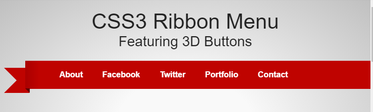
Ribbon Menu
1. HTML
<div id="container">
<header>
    <hgroup>
        <h1><a href="#">CSS3 Ribbon Menu</a></h1>
        <h2><a href="#">Featuring 3D Buttons</a></h2>
    </hgroup>

</header>
    <div id="menu">
    <nav>

    <ul>
    <span class="navbefore"></span>
   <li class="menu-item"><a href="#">About</a></li>
    <li class="menu-item"><a href="#">Facebook</a></li>
    <li class="menu-item"><a href="#">Twitter</a></li>
    <li class="menu-item"><a href="#">Portfolio</a></li>
    <li class="menu-item"><a href="#">Contact</a></li>
    <li class="menu-item noHover"><a href="#">.</a></li>
    <span class="navafter"></span>
    </ul>

    </nav>

    </div>


</div>
2. CSS
/*------------------------------------*\
  MAIN
\*------------------------------------*/
/* GO! */

body {
 font: 14px "Helvetica", Helvetica, Arial, sans-serif;
 color: #000;
}

a:link, a:visited {
  color: #222;
    text-decoration: none;
}
a:hover {
    color: #666;
    text-decoration: none;
}

h1, h2, h3, h4, h5 {
    font-size: 2.2em;
}

#container {
    width:100%;
    height:auto;
  padding-bottom:320px;
    background: #f9f9f9; /* Old browsers */
/* IE9 SVG, needs conditional override of 'filter' to 'none' */
background: url(data:image/svg+xml;base64,PD94bWwgdmVyc2lvbj0iMS4wIiA/Pgo8c3ZnIHhtbG5zPSJodHRwOi8vd3d3LnczLm9yZy8yMDAwL3N2ZyIgd2lkdGg9IjEwMCUiIGhlaWdodD0iMTAwJSIgdmlld0JveD0iMCAwIDEgMSIgcHJlc2VydmVBc3BlY3RSYXRpbz0ibm9uZSI+CiAgPHJhZGlhbEdyYWRpZW50IGlkPSJncmFkLXVjZ2ctZ2VuZXJhdGVkIiBncmFkaWVudFVuaXRzPSJ1c2VyU3BhY2VPblVzZSIgY3g9IjUwJSIgY3k9IjUwJSIgcj0iNzUlIj4KICAgIDxzdG9wIG9mZnNldD0iMjYlIiBzdG9wLWNvbG9yPSIjZjlmOWY5IiBzdG9wLW9wYWNpdHk9IjEiLz4KICAgIDxzdG9wIG9mZnNldD0iMTAwJSIgc3RvcC1jb2xvcj0iI2JmYmZiZiIgc3RvcC1vcGFjaXR5PSIxIi8+CiAgPC9yYWRpYWxHcmFkaWVudD4KICA8cmVjdCB4PSItNTAiIHk9Ii01MCIgd2lkdGg9IjEwMSIgaGVpZ2h0PSIxMDEiIGZpbGw9InVybCgjZ3JhZC11Y2dnLWdlbmVyYXRlZCkiIC8+Cjwvc3ZnPg==);
background: -moz-radial-gradient(center, ellipse cover,  #f9f9f9 26%, #bfbfbf 100%); /* FF3.6+ */
background: -webkit-gradient(radial, center center, 0px, center center, 100%, color-stop(26%,#f9f9f9), color-stop(100%,#bfbfbf)); /* Chrome,Safari4+ */
background: -webkit-radial-gradient(center, ellipse cover,  #f9f9f9 26%,#bfbfbf 100%); /* Chrome10+,Safari5.1+ */
background: -o-radial-gradient(center, ellipse cover,  #f9f9f9 26%,#bfbfbf 100%); /* Opera 12+ */
background: -ms-radial-gradient(center, ellipse cover,  #f9f9f9 26%,#bfbfbf 100%); /* IE10+ */
background: radial-gradient(center, ellipse cover,  #f9f9f9 26%,#bfbfbf 100%); /* W3C */
filter: progid:DXImageTransform.Microsoft.gradient( startColorstr='#f9f9f9', endColorstr='#bfbfbf',GradientType=1 ); /* IE6-8 fallback on horizontal gradient */

}


header {

    width: 100%;
    height: 10%;
    clear:both;
}

header hgroup {
    width: 75.2%;
    margin: 0 auto;
    text-align: center;
    padding-top: 3%;
    padding-bottom: 3%;
}

hgroup h1, hgroup h2 {


}
hgroup h1 {

    font-size: 3em;
}
hgroup h2 {
    font-size: 2em;
}

header a:link, header a:visited {

}

/* NAV */

#menu {
    clear: both;
    display: block;
    position:relative;
    width: 1000px; /* fixed width allows for empty area in ribbon to be correctly sized */
    height:56px;
    margin: 0 auto; /* for fluid layout margin on either side */
    z-index:1;
    background: transparent;

}

/* following after and before is for the nav container #menu to give it the cut end look */

#menu:after, #menu:before {
    margin-top:0.5em;
    content: "";
    border:1.8em solid #BF0300; /* Old browsers */
    float:left;
    position: relative;
    margin-top:14px;
    z-index:0;
}

#menu:after {

  position:relative;
  top: 0px;
  left:-8px;
  float:right;
  border-right-color:transparent;
}

#menu:before {
    left:8px;
   border-left-color:transparent;
}


/* actual navigation */

nav {
    width: 900px;
    height:56px;
    position:relative;
     float:left;
    top:0;
    left:0;
    /*-moz-box-shadow:  -6px 8px 6px -6px rgba(0,0,0,0.4);
  -webkit-box-shadow: -6px 8px 6px -6px rgba(0,0,0,0.4);
  box-shadow:         -6px 8px 6px -6px rgba(0,0,0,0.4);
 dropped due to error on iOS, fix soon */
    z-index:1;
}

nav ul {
    font-size: 16px;
    display:block;
    list-style: none;
    width:auto;
    margin: 0;
    padding-left: 0;
    overflow-y: visible;

}

/* So that the hover effect can retain transparency, the enitre nav cannot have a background.
these classes style spans on either side left & right of the ul list to keep the ribbon intact */

.navbefore {

position:relative;
display:block;
width: 48px !important; /* must equal nav li:first-child margin-left */
height: 56px;
background: rgb(170,0,0); /* Old browsers */
/* IE9 SVG, needs conditional override of 'filter' to 'none' */
background: url(data:image/svg+xml;base64,PD94bWwgdmVyc2lvbj0iMS4wIiA/Pgo8c3ZnIHhtbG5zPSJodHRwOi8vd3d3LnczLm9yZy8yMDAwL3N2ZyIgd2lkdGg9IjEwMCUiIGhlaWdodD0iMTAwJSIgdmlld0JveD0iMCAwIDEgMSIgcHJlc2VydmVBc3BlY3RSYXRpbz0ibm9uZSI+CiAgPGxpbmVhckdyYWRpZW50IGlkPSJncmFkLXVjZ2ctZ2VuZXJhdGVkIiBncmFkaWVudFVuaXRzPSJ1c2VyU3BhY2VPblVzZSIgeDE9IjAlIiB5MT0iMCUiIHgyPSIxMDAlIiB5Mj0iMCUiPgogICAgPHN0b3Agb2Zmc2V0PSIwJSIgc3RvcC1jb2xvcj0iI2FhMDAwMCIgc3RvcC1vcGFjaXR5PSIxIi8+CiAgICA8c3RvcCBvZmZzZXQ9IjU4JSIgc3RvcC1jb2xvcj0iI2JmMDMwMCIgc3RvcC1vcGFjaXR5PSIxIi8+CiAgICA8c3RvcCBvZmZzZXQ9Ijk5JSIgc3RvcC1jb2xvcj0iI2JmMDMwMCIgc3RvcC1vcGFjaXR5PSIxIi8+CiAgPC9saW5lYXJHcmFkaWVudD4KICA8cmVjdCB4PSIwIiB5PSIwIiB3aWR0aD0iMSIgaGVpZ2h0PSIxIiBmaWxsPSJ1cmwoI2dyYWQtdWNnZy1nZW5lcmF0ZWQpIiAvPgo8L3N2Zz4=);
background: -moz-linear-gradient(left,  rgba(170,0,0,1) 0%, rgba(191,3,0,1) 58%, rgba(191,3,0,1) 99%); /* FF3.6+ */
background: -webkit-gradient(linear, left top, right top, color-stop(0%,rgba(170,0,0,1)), color-stop(58%,rgba(191,3,0,1)), color-stop(99%,rgba(191,3,0,1))); /* Chrome,Safari4+ */
background: -webkit-linear-gradient(left,  rgba(170,0,0,1) 0%,rgba(191,3,0,1) 58%,rgba(191,3,0,1) 99%); /* Chrome10+,Safari5.1+ */
background: -o-linear-gradient(left,  rgba(170,0,0,1) 0%,rgba(191,3,0,1) 58%,rgba(191,3,0,1) 99%); /* Opera 11.10+ */
background: -ms-linear-gradient(left,  rgba(170,0,0,1) 0%,rgba(191,3,0,1) 58%,rgba(191,3,0,1) 99%); /* IE10+ */
background: linear-gradient(to right,  rgba(170,0,0,1) 0%,rgba(191,3,0,1) 58%,rgba(191,3,0,1) 99%); /* W3C */
filter: progid:DXImageTransform.Microsoft.gradient( startColorstr='#aa0000', endColorstr='#bf0300',GradientType=1 ); /* IE6-8 */

z-index:1;
 float:left;
}

.navafter {

position: relative;
display:block;
float:left;
width: 252px; /* must compensate for width of ul element, this width is changed via jQuery to compensate for hover */
height: 56px;
/*margin-left:548px;*/
background: rgb(191,3,0); /* Old browsers */
/* IE9 SVG, needs conditional override of 'filter' to 'none' */
background: url(data:image/svg+xml;base64,PD94bWwgdmVyc2lvbj0iMS4wIiA/Pgo8c3ZnIHhtbG5zPSJodHRwOi8vd3d3LnczLm9yZy8yMDAwL3N2ZyIgd2lkdGg9IjEwMCUiIGhlaWdodD0iMTAwJSIgdmlld0JveD0iMCAwIDEgMSIgcHJlc2VydmVBc3BlY3RSYXRpbz0ibm9uZSI+CiAgPGxpbmVhckdyYWRpZW50IGlkPSJncmFkLXVjZ2ctZ2VuZXJhdGVkIiBncmFkaWVudFVuaXRzPSJ1c2VyU3BhY2VPblVzZSIgeDE9IjAlIiB5MT0iMCUiIHgyPSIxMDAlIiB5Mj0iMCUiPgogICAgPHN0b3Agb2Zmc2V0PSIwJSIgc3RvcC1jb2xvcj0iI2JmMDMwMCIgc3RvcC1vcGFjaXR5PSIxIi8+CiAgICA8c3RvcCBvZmZzZXQ9IjgzJSIgc3RvcC1jb2xvcj0iI2JmMDMwMCIgc3RvcC1vcGFjaXR5PSIxIi8+CiAgICA8c3RvcCBvZmZzZXQ9IjEwMCUiIHN0b3AtY29sb3I9IiNhYTAwMDAiIHN0b3Atb3BhY2l0eT0iMSIvPgogIDwvbGluZWFyR3JhZGllbnQ+CiAgPHJlY3QgeD0iMCIgeT0iMCIgd2lkdGg9IjEiIGhlaWdodD0iMSIgZmlsbD0idXJsKCNncmFkLXVjZ2ctZ2VuZXJhdGVkKSIgLz4KPC9zdmc+);
background: -moz-linear-gradient(left,  rgba(191,3,0,1) 0%, rgba(191,3,0,1) 83%, rgba(170,0,0,1) 100%); /* FF3.6+ */
background: -webkit-gradient(linear, left top, right top, color-stop(0%,rgba(191,3,0,1)), color-stop(83%,rgba(191,3,0,1)), color-stop(100%,rgba(170,0,0,1))); /* Chrome,Safari4+ */
background: -webkit-linear-gradient(left,  rgba(191,3,0,1) 0%,rgba(191,3,0,1) 83%,rgba(170,0,0,1) 100%); /* Chrome10+,Safari5.1+ */
background: -o-linear-gradient(left,  rgba(191,3,0,1) 0%,rgba(191,3,0,1) 83%,rgba(170,0,0,1) 100%); /* Opera 11.10+ */
background: -ms-linear-gradient(left,  rgba(191,3,0,1) 0%,rgba(191,3,0,1) 83%,rgba(170,0,0,1) 100%); /* IE10+ */
background: linear-gradient(to right,  rgba(191,3,0,1) 0%,rgba(191,3,0,1) 83%,rgba(170,0,0,1) 100%); /* W3C */
filter: progid:DXImageTransform.Microsoft.gradient( startColorstr='#bf0300', endColorstr='#aa0000',GradientType=1 ); /* IE6-8 */
z-index:1;

}

/* since the #menu container uses before and after to style the ends of the ribbon,
i decided to make the folds on either side of the nav using :before and :after
you could do this by styling the content, but thought this approach to be easier */


nav ul .navbefore:before, nav ul .navafter:after
    {
        content: '';
        position: absolute;
        border-style: solid;
        border-color: transparent;
        bottom: -8px;
    }

   nav ul .navbefore:before
    {
        border-width: 0 9px 9px 0;
        border-right-color: #5E0100;
        left: 0px;

    }

   nav ul .navafter:after    {
        border-width: 0 0 8px 8px;
        border-left-color: #5E0100;
        right:0;
    }


/* finally, we style a list element */

nav li {
    float: left;
    position: relative;
    z-index:44;
    -moz-transform: translate(0px, 0px);
    -webkit-transform: translate(0px, 0px);
    -o-transform: translate(0px, 0px);
    -ms-transform:  translate(0px, 0px);
    transform: translate(0px, 0px);


}


nav li:first-child {
     margin-left:48px !important; /* this value should equal the width of .navbefore */
}


nav li a:link, nav li a:visited {
    color: #fff;
    display: block;
    line-height: 3.5em;
    padding: 0 1.2125em;
    text-decoration: none;
    font-weight:bolder;
    background: #BF0300;


}

/* transforms the li element on hover, could be animated instead */

nav li:hover {
    -moz-transform: translate(18px, -8px);
        -webkit-transform: translate(18px, -8px);
        -o-transform: translate(18px, -8px);
        -ms-transform:  translate(18px, -8px);
        transform: translate(18px, -8px);
    padding-top:18px !important; /* Fixes hover glitch when user moves mouse just above the pressed down li element */
}

/* changes the background color of the link inside the list element */


nav li:hover a:link {
    color: #fff;

    background: rgb(155,0,0); /* Old browsers */
/* IE9 SVG, needs conditional override of 'filter' to 'none' */
background: url(data:image/svg+xml;base64,PD94bWwgdmVyc2lvbj0iMS4wIiA/Pgo8c3ZnIHhtbG5zPSJodHRwOi8vd3d3LnczLm9yZy8yMDAwL3N2ZyIgd2lkdGg9IjEwMCUiIGhlaWdodD0iMTAwJSIgdmlld0JveD0iMCAwIDEgMSIgcHJlc2VydmVBc3BlY3RSYXRpbz0ibm9uZSI+CiAgPGxpbmVhckdyYWRpZW50IGlkPSJncmFkLXVjZ2ctZ2VuZXJhdGVkIiBncmFkaWVudFVuaXRzPSJ1c2VyU3BhY2VPblVzZSIgeDE9IjAlIiB5MT0iMCUiIHgyPSIxMDAlIiB5Mj0iMCUiPgogICAgPHN0b3Agb2Zmc2V0PSIwJSIgc3RvcC1jb2xvcj0iIzliMDAwMCIgc3RvcC1vcGFjaXR5PSIxIi8+CiAgICA8c3RvcCBvZmZzZXQ9IjUwJSIgc3RvcC1jb2xvcj0iI2JmMDMwMCIgc3RvcC1vcGFjaXR5PSIxIi8+CiAgICA8c3RvcCBvZmZzZXQ9IjEwMCUiIHN0b3AtY29sb3I9IiNhMzAwMDAiIHN0b3Atb3BhY2l0eT0iMSIvPgogIDwvbGluZWFyR3JhZGllbnQ+CiAgPHJlY3QgeD0iMCIgeT0iMCIgd2lkdGg9IjEiIGhlaWdodD0iMSIgZmlsbD0idXJsKCNncmFkLXVjZ2ctZ2VuZXJhdGVkKSIgLz4KPC9zdmc+);
background: -moz-linear-gradient(left,  rgba(155,0,0,1) 0%, rgba(191,3,0,1) 50%, rgba(163,0,0,1) 100%); /* FF3.6+ */
background: -webkit-gradient(linear, left top, right top, color-stop(0%,rgba(155,0,0,1)), color-stop(50%,rgba(191,3,0,1)), color-stop(100%,rgba(163,0,0,1))); /* Chrome,Safari4+ */
background: -webkit-linear-gradient(left,  rgba(155,0,0,1) 0%,rgba(191,3,0,1) 50%,rgba(163,0,0,1) 100%); /* Chrome10+,Safari5.1+ */
background: -o-linear-gradient(left,  rgba(155,0,0,1) 0%,rgba(191,3,0,1) 50%,rgba(163,0,0,1) 100%); /* Opera 11.10+ */
background: -ms-linear-gradient(left,  rgba(155,0,0,1) 0%,rgba(191,3,0,1) 50%,rgba(163,0,0,1) 100%); /* IE10+ */
background: linear-gradient(left,  rgba(155,0,0,1) 0%,rgba(191,3,0,1) 50%,rgba(163,0,0,1) 100%); /* W3C */
filter: progid:DXImageTransform.Microsoft.gradient( startColorstr='#9b0000', endColorstr='#a30000',GradientType=1 ); /* IE6-8 */
}
/* gives the list element a skewed depth pseudo element to the left (before) , fold to the right (after) */
     nav ul li:before, nav ul li:after
    {
        content: '';
        position: absolute;
        border-color: transparent;
        bottom: 0px;
    }

     nav ul li:before {
         display:block;
       width:0px;
       height:0px;
            -moz-transform: translate(0px,0px) skew(0deg,0deg);
        -webkit-transform: translate(0px,0px) skew(0deg,0deg);
        -o-transform: translate(0px,0px) skew(0deg,0deg);
        -ms-transform: translate(0px,0px) skew(0deg,0deg);
        transform: translate(0px,0px) skew(0deg,0deg);
}

     nav ul li:hover:before  {
       display:block;
       width:18px;
       height:56px;

        background: rgb(191,3,0); /* Old browsers */
        /* IE9 SVG, needs conditional override of 'filter' to 'none' */
        background: url(data:image/svg+xml;base64,PD94bWwgdmVyc2lvbj0iMS4wIiA/Pgo8c3ZnIHhtbG5zPSJodHRwOi8vd3d3LnczLm9yZy8yMDAwL3N2ZyIgd2lkdGg9IjEwMCUiIGhlaWdodD0iMTAwJSIgdmlld0JveD0iMCAwIDEgMSIgcHJlc2VydmVBc3BlY3RSYXRpbz0ibm9uZSI+CiAgPGxpbmVhckdyYWRpZW50IGlkPSJncmFkLXVjZ2ctZ2VuZXJhdGVkIiBncmFkaWVudFVuaXRzPSJ1c2VyU3BhY2VPblVzZSIgeDE9IjAlIiB5MT0iMCUiIHgyPSIxMDAlIiB5Mj0iMCUiPgogICAgPHN0b3Agb2Zmc2V0PSIxJSIgc3RvcC1jb2xvcj0iI2JmMDMwMCIgc3RvcC1vcGFjaXR5PSIxIi8+CiAgICA8c3RvcCBvZmZzZXQ9IjQwJSIgc3RvcC1jb2xvcj0iI2EzMDAwMCIgc3RvcC1vcGFjaXR5PSIxIi8+CiAgICA8c3RvcCBvZmZzZXQ9IjEwMCUiIHN0b3AtY29sb3I9IiM4NDA0MDAiIHN0b3Atb3BhY2l0eT0iMSIvPgogIDwvbGluZWFyR3JhZGllbnQ+CiAgPHJlY3QgeD0iMCIgeT0iMCIgd2lkdGg9IjEiIGhlaWdodD0iMSIgZmlsbD0idXJsKCNncmFkLXVjZ2ctZ2VuZXJhdGVkKSIgLz4KPC9zdmc+);
        background: -moz-linear-gradient(left,  rgba(191,3,0,1) 1%, rgba(163,0,0,1) 40%, rgba(132,4,0,1) 100%); /* FF3.6+ */
        background: -webkit-gradient(linear, left top, right top, color-stop(1%,rgba(191,3,0,1)), color-stop(40%,rgba(163,0,0,1)), color-stop(100%,rgba(132,4,0,1))); /* Chrome,Safari4+ */
        background: -webkit-linear-gradient(left,  rgba(191,3,0,1) 1%,rgba(163,0,0,1) 40%,rgba(132,4,0,1) 100%); /* Chrome10+,Safari5.1+ */
        background: -o-linear-gradient(left,  rgba(191,3,0,1) 1%,rgba(163,0,0,1) 40%,rgba(132,4,0,1) 100%); /* Opera 11.10+ */
        background: -ms-linear-gradient(left,  rgba(191,3,0,1) 1%,rgba(163,0,0,1) 40%,rgba(132,4,0,1) 100%); /* IE10+ */
        background: linear-gradient(left,  rgba(191,3,0,1) 1%,rgba(163,0,0,1) 40%,rgba(132,4,0,1) 100%); /* W3C */
        filter: progid:DXImageTransform.Microsoft.gradient( startColorstr='#bf0300', endColorstr='#840400',GradientType=1 ); /* IE6-8 */


        -webkit-transform: translate(-18px,-5px) skew(0deg,28deg);
        -o-transform: translate(-18px,-5px) skew(0deg,28deg);
        -ms-transform: translate(-18px,-5px) skew(0deg,28deg);
        transform: translate(-18px,-5px) skew(0deg,28deg);
        /* doesnt work  -moz-transform: translate(-18px,-5px) skew(0deg,28deg); */
    }

@-moz-document url-prefix() {

    nav ul li:hover:before {
        margin-left:-18px;
        margin-bottom:3px;
        -moz-transform: translateY(-2px);
        -moz-transform: skewX(0deg);
         -moz-transform: skewY(28deg);
    }

}

    nav ul li:hover:after  {
        border-width: 0 0 10px 10px;
        border-left-color: #5E0100;
        right: -10px;
   border-style: solid;

    }

    /* moves the next list element over 18px, why 18px? well thats the width of nav ul li:hover:before (16px + 2px border) */

nav li:hover + li  {

    -moz-transform: translate(18px, 0px);
        -webkit-transform: translate(18px, 0px);
        -o-transform: translate(18px, 0px);
        -ms-transform:  translate(18px, 0px);
        transform: translate(18px, 0px);

}
nav li.noHover a:link, nav li.noHover a:visited {
 color:rgb(191,3,0);
  background: #BF0300;
  width:68px;
}
nav li.noHover:hover {
    background:rgb(191,3,0);
    -moz-transform: translate(0px, 0px);
    -webkit-transform: translate(0px, 0px);
    -o-transform: translate(0px, 0px);
    -ms-transform:  translate(0px, 0px);
    transform: translate(0px, 0px);
    padding-top:0px !important; /* Fixes hover glitch when user moves mouse just above the pressed down li element */
}
nav li.noHover:hover a:link {
   color:rgb(191,3,0);

}
nav ul li.noHover:hover:before  {
  display:none;
}
nav ul li.noHover:hover:after  {
  border:0 none;
}
/*nav li:hover + span  {
    width:262px;
    -moz-transform: translate(0px, 0px);
        -webkit-transform: translate(0px, 0px);
        -o-transform: translate(0px, 0px);
        -ms-transform:  translate(0px, 0px);
        transform: translate(0px, 0px);

}*/

#credits {
  clear:both;
  font-size: 0.5em;
  width: 100%;
  text-align: center;
  padding-top: 36px;
}
3. JAVASCRIPT
Mong bài viết giúp ích được các bạn phần nào trong thiết kế Web. Hãy nhấn nút Chia sẻđể mọi người cùng học hỏi kiến thức mới nhé. Cảm ơn các bạn đã quan tâm Forum.