Off Canvas CSS Menu
Chia sẻ
Mẫu menu lạ lạ share ae coi chơi
1. HTML
<nav>
<ul>
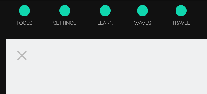
<li>
<i class="icon-tools"></i>
<h4>TOOLS</h4>
</li>
<li>
<i class="icon-cog"></i>
<h4>SETTINGS</h4>
</li>
<li>
<i class="icon-lifebuoy"></i>
<h4>LEARN</h4>
</li>
<li>
<i class="icon-air"></i>
<h4>WAVES</h4>
</li>
<li>
<i class="icon-suitcase"></i>
<h4>TRAVEL</h4>
</li>
</ul>
</nav>
<div class="container"><div class="menu-icon"><span></span></div></div>2. CSS
@import "compass/css3";

*, *::before, *::after { @include box-sizing(border-box) }

$shadowlength: 60;

@function makelongshadow($color) {
  $val: 0px 0px $color;
  @for $i from 1 through $shadowlength {
    $val: #{$val}, #{$i}px #{$i}px #{$color};
  }
  @return $val;
}

@mixin longshadow($color) {
  text-shadow: makelongshadow($color);
}

@import url(https://markmurray.co/codepen/customstyle.css), url(https://fonts.googleapis.com/css?family=Raleway:100);

html, body {
  background: #111;
  height: 100%;
  font-family: Raleway, sans-serif;
}

.container {
  background: #eff0f1;
  width: 100%;
  height: 100%;
  margin: 0 auto;
  @include transition(all 0.3s ease 0.6s);
  z-index: 10;
  padding: 2em;
  position: relative;

}

.container.nav-open {
  margin-top: 8em;
  width: 90%;
  @include transition(all 0.3s ease);
}

/*
  menu icon css3
*/

.menu-icon {
  position: relative;
  display: block;
  width: 2.5em;
  height: 2.5em;
  cursor: pointer;


  &:hover span {
    background: #222;

    &:before, &:after { background: #222; }
  }
}

.menu-icon > span {
  position: absolute;
  top: 50%;
  display: block;
  width: 100%;
  height: 0.25em;
  background-color: lighten(#222, 60%);
  border-radius: 3px;
  @include transition(transform 0.3s, background 0.25s ease);
}

.menu-icon > span:before,
.menu-icon > span:after {
  content: "";
  position: absolute;
  width: 100%;
  height: 100%;
  background-color: lighten(#222, 60%);
  border-radius: 3px;
  @include transition(transform 0.3s, background 0.25s ease);
}

.menu-icon > span:before {
	   @include transform(translateY(-0.75em));
}

.menu-icon > span:after {

	   @include transform(translateY(0.75em));
}

/* OPENED */

.menu-icon.open {
  -webkit-transform: rotate(45deg);
	        transform: rotate(45deg);
}

.menu-icon.open > span:before {
  -webkit-transform: rotate(90deg);
	        transform: rotate(90deg);
}

.menu-icon.open > span:after {
  -webkit-transform: rotate(90deg);
	        transform: rotate(90deg);
}

nav {
  position: fixed;
  top: 0; left: 5%;
  color: white;
  z-index: 1;

  ul {

    li.animate {
      top: 0;
    }

    li {
      display: inline-block;
      text-align: center;
      margin: 1em 2em;
      cursor: pointer;
      position: relative;
      top: -8em;
      $speed: 0.3s;
      $icons: 3;

      &:nth-child(1){ @include transition(top $speed ease 0.15s); }
      &:nth-child(2){ @include transition(top $speed ease 0.2s); }
      &:nth-child(3){ @include transition(top $speed ease 0.25s); }
      &:nth-child(4){ @include transition(top $speed ease 0.3s); }
      &:nth-child(5){ @include transition(top $speed ease 0.35s); }


      &:hover { opacity: 1; }

      i {
        font-size: 1.5em;
        background: #10d7af;
        padding: 0.75em;
        border-radius: 50%;
        color: white;
        display: inline-block;
        overflow: hidden;
        @include longshadow(rgba(12, 168, 136, 1));
      }

      h4 {
        line-height: 2.5;
      }
    }
  }

}
3. JAVASCRIPT
https://cdnjs.cloudflare.com/ajax/libs/jquery/2.1.3/jquery.min.js

(function($){

  $(".menu-icon").on("click", function(){
    	$(this).toggleClass("open");
    	$(".container").toggleClass("nav-open");
    	$("nav ul li").toggleClass("animate");
  });

})(jQuery);
Mong bài viết giúp ích được các bạn phần nào trong thiết kế Web. Hãy nhấn nút Chia sẻđể mọi người cùng học hỏi kiến thức mới nhé. Cảm ơn các bạn đã quan tâm Forum.