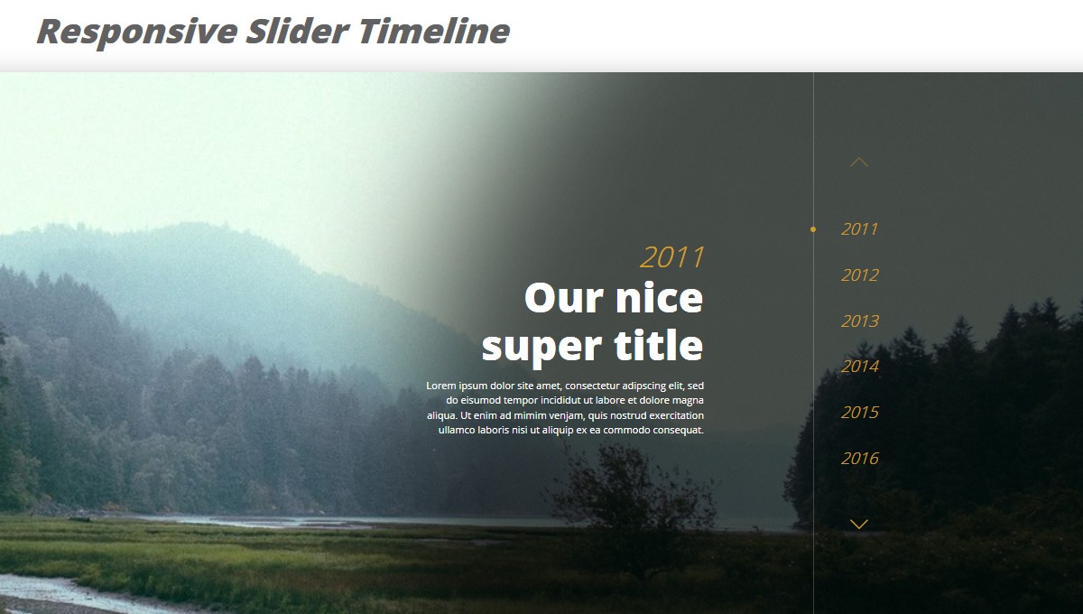
RESPONSIVE SLIDER TIMELINE
Chia sẻ
Một dòng thời gian trượt đáp ứng được thực hiện với thư viện Swiper JS.
1. HTML
//HTML dạng Pug
.container
  h1.title Responsive Slider Timeline
  .timeline
    .swiper-container
      .swiper-wrapper
        - for (var i = 1; i <= 6; ++i) {
          .swiper-slide(
            style=`background-image: url(https://unsplash.it/1920/500?image=1${i}`,
            data-year=`201${i}`
          )
            .swiper-slide-content
              span.timeline-year 201#{i}
              h4.timeline-title Our nice super title
              p.timeline-text Lorem ipsum dolor site amet, consectetur adipscing elit, sed do eisumod tempor incididut ut labore et dolore magna aliqua. Ut enim ad mimim venjam, quis nostrud exercitation ullamco laboris nisi ut aliquip ex ea commodo consequat.
        - }
      .swiper-button-prev
      .swiper-button-next
      .swiper-pagination
2. CSS
// Colors
$white: #fff;
$black: #000;
$primary: #d4a024;
$gray: #616161;

// Base style
html,
body,
.container { height: 100%; }

body {
  font-family: 'Open Sans', sans-serif;
  font-size: 14px;
}

.container {
  display: flex;
  justify-content: center;
  align-items: center;
  background-color: #fff;
  flex-direction: column;
}

.title {
  font-size: 38px;
  color: $gray;
  font-style: italic;
  font-weight: 800;
}

// Timeline
.timeline {
  width: 100%;
  background-color: #fff;
  box-shadow: 0 5px 25px 5px rgba($black, .2);

  .swiper-container {
    height: 600px;
    width: 100%;
    position: relative;
  }

  .swiper-wrapper { transition: 2s cubic-bezier(.68,-0.4,.27,1.34) .2s; }

  .swiper-slide {
    position: relative;
    color: $white;
    overflow: hidden;
    background-size: cover;
    background-repeat: no-repeat;
    background-position: center center;

    &::after {
      content: "";
      position: absolute;
      z-index: 1;
      right: -115%;
      bottom: -10%;
      width: 100%;
      height: 100%;
      background-color: rgba($black, .7);
      box-shadow: -230px 0 150px 60vw rgba($black, .7);
      border-radius: 100%;
    }

    &-content {
      position: absolute;
      text-align: center;
      width: 80%;
      max-width: 310px;
      right: 50%;
      top: 13%;
      transform: translate(50%, 0);
      font-size: 12px;
      z-index: 2;
    }

    .timeline-year {
      display: block;
      font-style: italic;
      font-size: 42px;
      margin-bottom: 50px;
      transform: translate3d(20px, 0, 0);
      color: $primary;
      font-weight: 300;
      opacity: 0;
      transition: .2s ease .4s;
    }

    .timeline-title {
      font-weight: 800;
      font-size: 34px;
      margin: 0 0 30px;
      opacity: 0;
      transform: translate3d(20px, 0, 0);
      transition: .2s ease .5s;
    }

    .timeline-text {
      line-height: 1.5;
      opacity: 0;
      transform: translate3d(20px, 0, 0);
      transition: .2s ease .6s;
    }

    &-active {
      .timeline-year {
        opacity: 1;
        transform: translate3d(0, 0, 0);
        transition: .4s ease 1.6s;
      }

      .timeline-title {
        opacity: 1;
        transform: translate3d(0, 0, 0);
        transition: .4s ease 1.7s;
      }

      .timeline-text {
        opacity: 1;
        transform: translate3d(0, 0, 0);
        transition: .4s ease 1.8s;
      }
    }
  }

  .swiper-pagination {
    right: 15%!important;
    height: 100%;
    display: none;
    flex-direction: column;
    justify-content: center;
    font-style: italic;
    font-weight: 300;
    font-size: 18px;
    z-index: 1;

    &::before {
      content: "";
      position: absolute;
      left: -30px;
      top: 0;
      height: 100%;
      width: 1px;
      background-color: rgba($white, .2);
    }

    &-bullet {
      width: auto;
      height: auto;
      text-align: center;
      opacity: 1;
      background: transparent;
      color: $primary;
      margin: 15px 0!important;
      position: relative;

      &::before {
        content: "";
        position: absolute;
        top: 8px;
        left: -32.5px;
        width: 6px;
        height: 6px;
        border-radius: 100%;
        background-color: $primary;
        transform: scale(0);
        transition: .2s;
      }

      &-active {
        color: $primary;

        &::before { transform: scale(1); }
      }
    }
  }

  .swiper-button-next,
  .swiper-button-prev {
    background-size: 20px 20px;
    top: 15%;
    width: 20px;
    height: 20px;
    margin-top: 0;
    z-index: 2;
    transition: .2s;
  }

  .swiper-button-prev {
    left: 8%;
    background-image: url("data:image/svg+xml;charset=utf-8,%3Csvg%20xmlns%3D'http%3A%2F%2Fwww.w3.org%2F2000%2Fsvg'%20viewBox%3D'0%200%2027%2044'%3E%3Cpath%20d%3D'M0%2C22L22%2C0l2.1%2C2.1L4.2%2C22l19.9%2C19.9L22%2C44L0%2C22L0%2C22L0%2C22z'%20fill%3D'%23d4a024'%2F%3E%3C%2Fsvg%3E");

    &:hover { transform: translateX(-3px); }
  }

  .swiper-button-next {
    right: 8%;
    background-image: url("data:image/svg+xml;charset=utf-8,%3Csvg%20xmlns%3D'http%3A%2F%2Fwww.w3.org%2F2000%2Fsvg'%20viewBox%3D'0%200%2027%2044'%3E%3Cpath%20d%3D'M27%2C22L27%2C22L5%2C44l-2.1-2.1L22.8%2C22L2.9%2C2.1L5%2C0L27%2C22L27%2C22z'%20fill%3D'%23d4a024'%2F%3E%3C%2Fsvg%3E");

    &:hover { transform: translateX(3px); }
  }

  @media screen and (min-width: 768px) {
    .swiper-slide {
      &::after {
        right: -30%;
        bottom: -8%;
        width: 240px;
        height: 50%;
        box-shadow: -230px 0 150px 50vw rgba($black, .7);
      }

      &-content {
        right: 30%;
        top: 50%;
        transform: translateY(-50%);
        width: 310px;
        font-size: 11px;
        text-align: right;
      }

      .timeline-year {
        margin-bottom: 0;
        font-size: 32px;
      }

      .timeline-title {
        font-size: 46px;
        margin: 0;
      }
    }

    .swiper-pagination { display: flex; }

    .swiper-button-prev {
      top: 15%;
      left: auto;
      right: 15%;
      transform: rotate(90deg) translate(0, 10px);

      &:hover { transform: rotate(90deg) translate(-3px, 10px); }
    }

    .swiper-button-next {
      top: auto;
      bottom: 15%;
      right: 15%;
      transform: rotate(90deg) translate(0, 10px);

      &:hover { transform: rotate(90deg) translate(3px, 10px); }
    }
  }

  @media screen and (min-width: 1024px) {
    .swiper-slide {
      &::after {
        right: -20%;
        bottom: -12%;
        width: 240px;
        height: 50%;
        box-shadow: -230px 0 150px 39vw rgba($black, .7);
      }

      &-content { right: 25%; }
    }
  }
}
3. JAVASCRIPT
var timelineSwiper = new Swiper ('.timeline .swiper-container', {
  direction: 'vertical',
  loop: false,
  speed: 1600,
  pagination: '.swiper-pagination',
  paginationBulletRender: function (swiper, index, className) {
    var year = document.querySelectorAll('.swiper-slide')[index].getAttribute('data-year');
    return '' + year + '';
  },
  paginationClickable: true,
  nextButton: '.swiper-button-next',
  prevButton: '.swiper-button-prev',
  breakpoints: {
    768: {
      direction: 'horizontal',
    }
  }
});
Mong bài viết giúp ích được các bạn phần nào trong thiết kế Web. Hãy nhấn nút Chia sẻđể mọi người cùng học hỏi kiến thức mới nhé. Cảm ơn các bạn đã quan tâm Forum.